Starting off a Monday with a few entryways or foyers to decide between. My grand entrance to the week.
Am focused on the flooring here in these two spaces…checkered floors in entryways or foyers a definite must love!
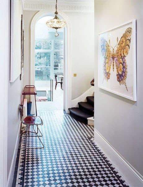
I found this first photo and loved the micro check tiled entry…a black and white tile mosaic laid on the diagonal…a miniature version of a classic used in so many grand foyers. The size and scale of the tile design is appropriate for this entry into what seems to be a normal house. I think the butterfly print on the wall in this room is quite funny and cute too.
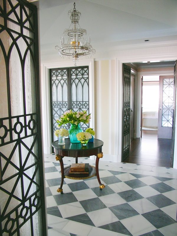
Then there is this second entry below, with grey and white marble tiles set in a checkered pattern and laid on the diagonal. This larger check floor is more traditional and more indicative of a very grand entrance. The iron and glass doors seem to mysteriously lead to rooms in what could be a cavernous home. And then there is that formal (but maybe a little too small) entry table greeting guests in a manner fitting of a fine home. I love grand entrances.
So I ask you today darling readers which foyer flooring do you like better…THIS OR THAT?
All that being said…my favorite is the first photo? Which is yours? If you had room for a nice checkered floor, would you go large or small? Or not at all (a rhyme!)? Do tell.
Happy Monday!
xo
Coco
Photos: Elle Deco Spain; Frank Roop






LUV the first entry! It is crisp, timeless in a modern way…franki
I love the second flooring. I actually have black and white marble in my entry. It is white with black ciamonds and black edging, but in my guest bathroom I have a checker board marble tile and It is an all time fav of mine and it was a dream come true to have it installed. You can see both floors on my blog side bar!!! You can’t go wrong with a classic! Happy Monday,Kathysue
I like them both! But I do prefer a larger checkered pattern for the floor…
I would vote for the second one that has more elegance and is very lovely. The first one is too busy for my taste.
Love the first photo……wall color is so soothing and the other fun patterns and art pop!
Love the first one! Where can I get that butterfly print?
I’m in love with anything cast iron. So I have to vote for the 2nd one. I love the way the doors look with that floor, and the wood from the table keeps it from being too cold.
Love a black and white floor and the second image is perfection!!
Doors + floor do it for me in the second photo but I like them both.
Also wanted to tell you that I am loving the green collage of COCOCOZY pillows 🙂
For me it’s number 2! The classic proportions entice me!
Lovely post again!
I like all the small details in the first picture, the light, moldings, etc. but I’d lay down a runner to quiet the floor. I like the marble floor better in the second but all that iron is too much for me. Thanks for sharing!
I would have to side with the 1st image as well…love the whimsical aspects it has.
I would go with the first image for a space that was smaller, and if I was in a space that was bigger, I would use the larger tiles from the second picture.
The black and white is such a classic. J’adore!!
I really like them both.
Though if I was in a smaller space, I would want to use the smaller tiles from the first picture, and in a bigger space, the tiles from the second photo.
Love the first one! Could be modern, could be vintage… My kind of floor!
I love the first one. In my new (!!!) home I am thinking of doing a brown and white diagonal checkerboard in the kitchen.