logo
inline logo
  • Blog
  • Design
    • Kitchen
    • Bath
    • Bedroom
    • Living Room
    • Outdoor Living
  • Style
    • Fashion
    • Best of
    • Design On Sale
  • Projects
  • Travel
  • Shopping Guides
    • Gift Guides
    • Resources
    • Wishlist
  • About Coco
    • Meet Coco
    • Press
    • Contact

What are you looking for?

main logo
  • Blog
  • Design
    • Kitchen
    • Bath
    • Bedroom
    • Living Room
    • Outdoor Living
  • Style
    • Fashion
    • Best of
    • Design On Sale
  • Projects
  • Travel
  • Shopping Guides
    • Gift Guides
    • Resources
    • Wishlist
  • About Coco
    • Meet Coco
    • Press
    • Contact
imageinteriors
share
Foyer

Foyer Makeover for a Small Entryway

September 24, 2019
  • Share

A foyer makeover was on my list of things to do for the end of August. I’m thrilled that I finally figured out how to design it. The entryway to my house is small but well defined. The area just ended up a bit forgotten, I never thought of doing anything with it until I partnered with Home Depot. I’m doing a fall refresh for my house and it includes a guest room makeover (coming soon!) and updating my foyer!

This area has definitely been neglected. The space immediately on either side of the entrance to my home is so small there isn’t space to design and decorate. I decided to create a foyer moment in the space right after entering my home. Being a small wall I knew I would have to work strategically to create the grand foyer I was dreaming of. I knew the perfect solution would be to bring simple style to the area with a table and other decor items. In the end, I chose a shimmering golden theme that would reflect some light and not be too bulky. 

BEFORE

Alt tag for FOYER_MAKEOVER_2
share

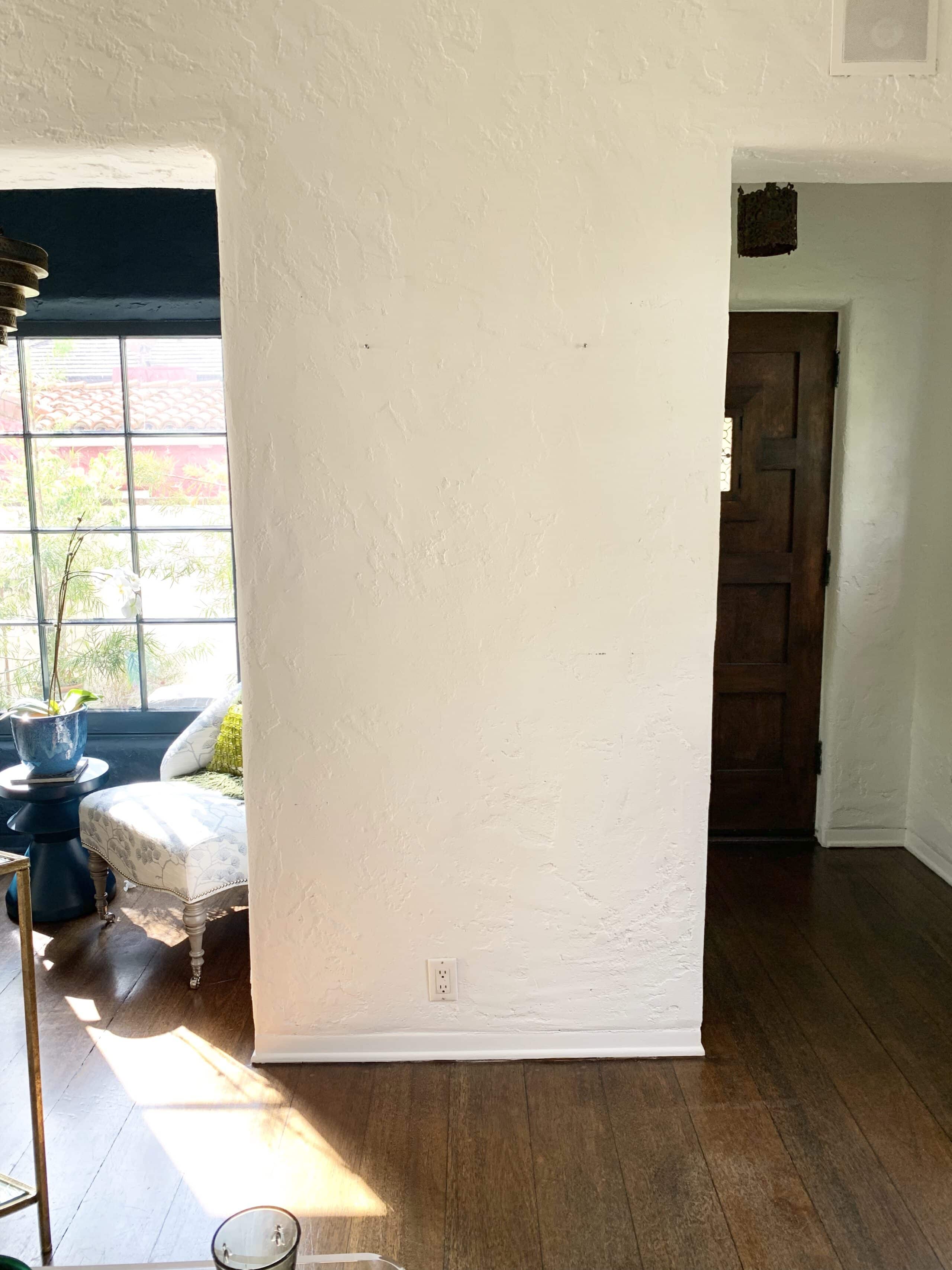
In the before image its very clear that the space is small and has nothing interesting going on. I designed the rest of my home first and left this space as one of the last spots on my list.

Alt tag for Foyer 2 moodboard
share

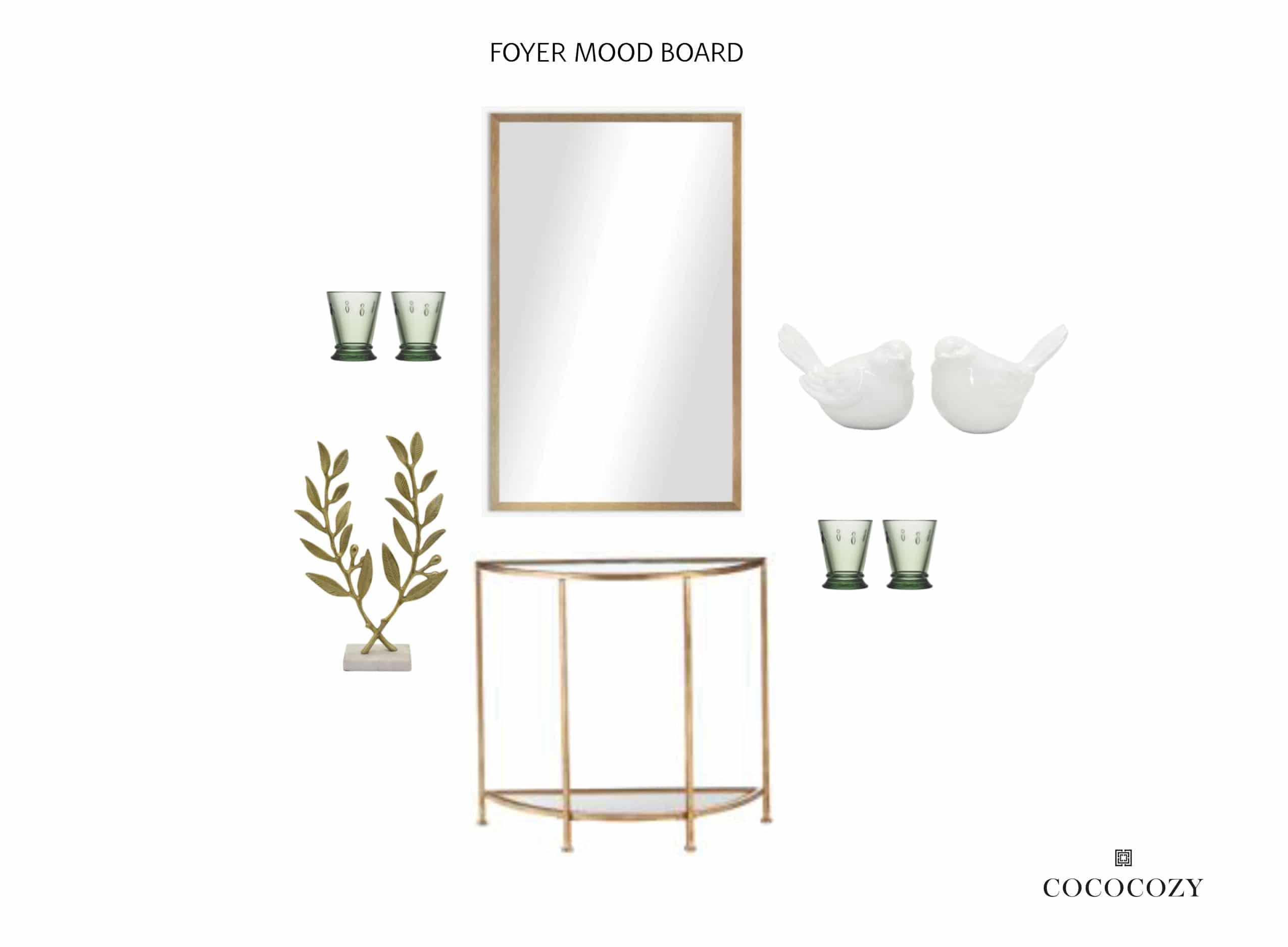
Since I knew I would be going to Home Depot for all of my decor needs I created a mood board before I got started. I chose a variety of items that fit the golden theme and were appropriate for space. 

image
share

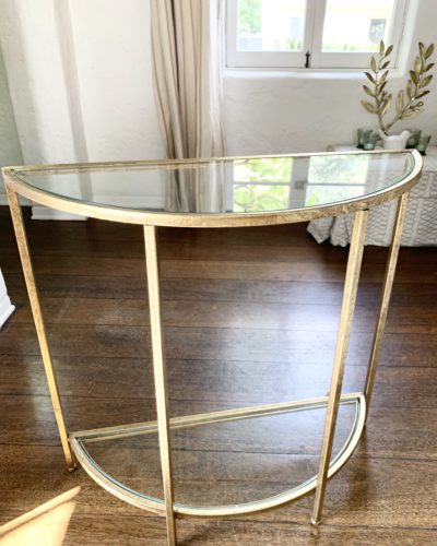
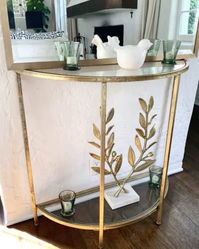
I found this stunning demilune console table. It’s great because the surfaces are glass and the gold creates clean lines. The perfect simple and elegant table for the space. Not to forget, that it perfectly fits on the wall and the half-circle design keeps it slim and dainty.

image
share

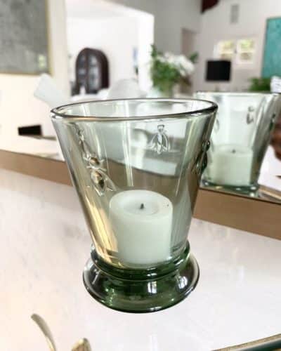
I went with small green glasses to add a bit of color but not too much. Green is the perfect color to liven up a space without being too dramatic. These little glasses are simple, chic, and comforting. 

image
share

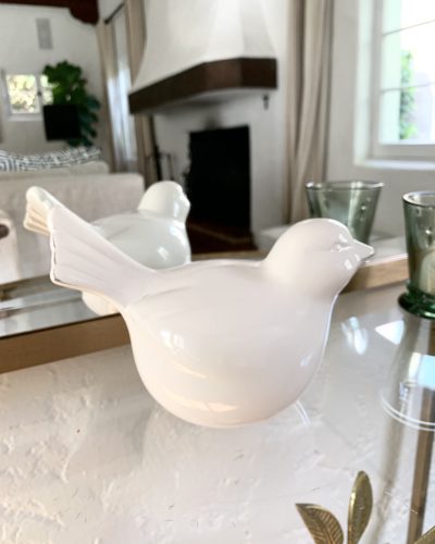
Next, I chose a white ceramic bird for a bit of whimsy. The white also adds a bit of simplicity compared to the other items.

image
share

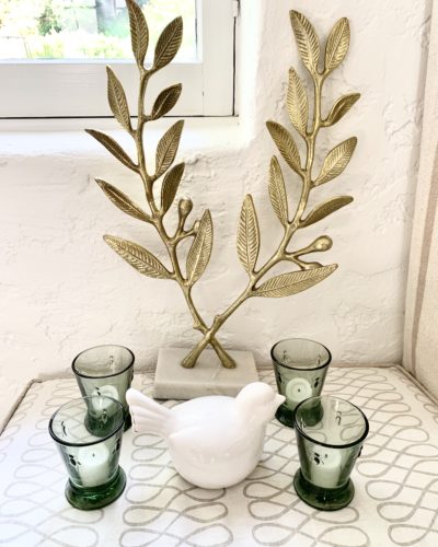
I planned on using two leaf sculptures but they were so big when they came that I went with one. I wanted to bring in a little foliage into the mix with the golden leaves. I like that the sculpture is almost like olive branches and feels very familiar. 

Alt tag for FOYER_MAKEOVER_9
share

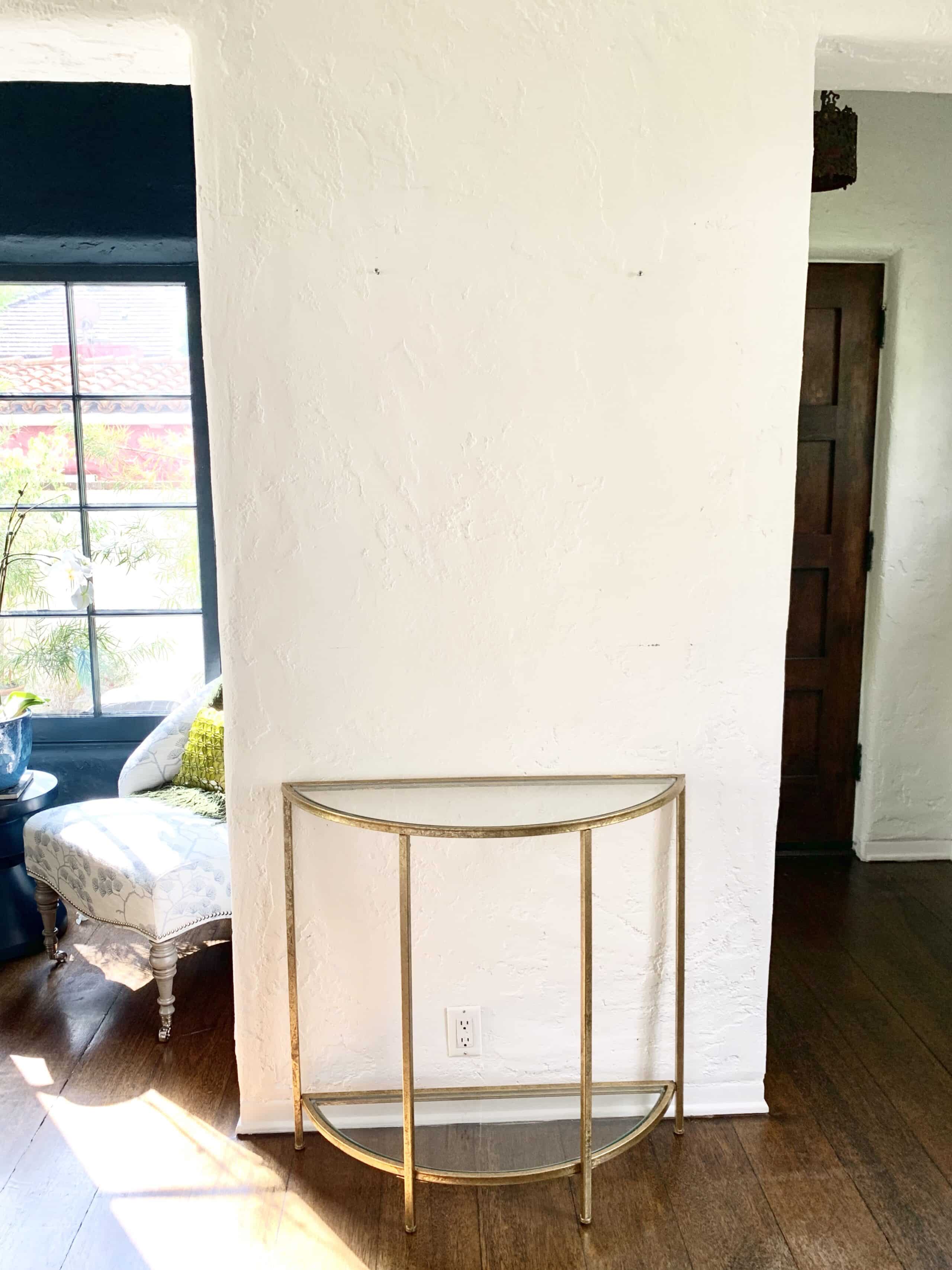
Here’s an image of the design starting to come together. That table is the perfect size for this wall! If it were any larger it would overwhelm the wall.
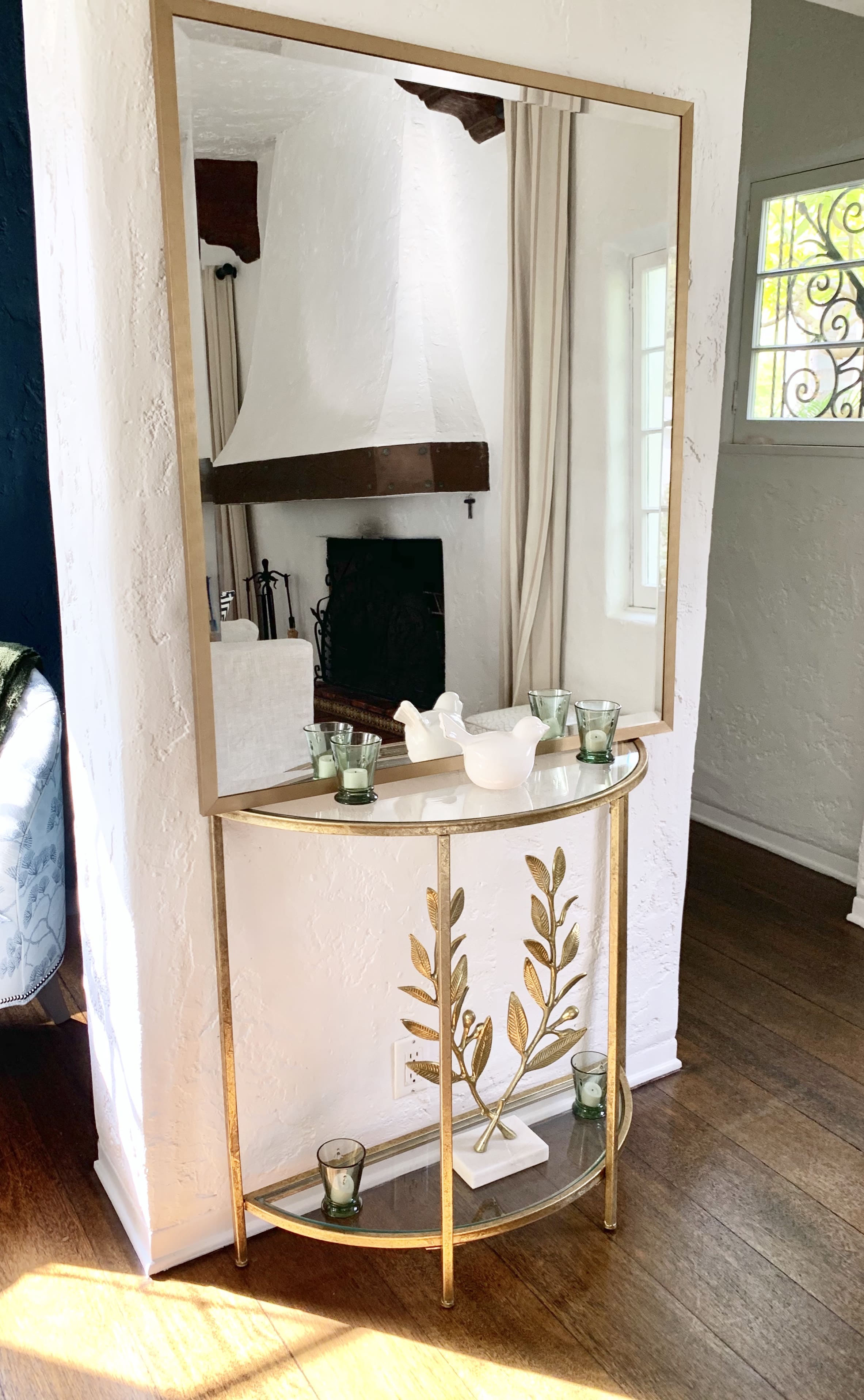
AFTER

Alt tag for FOYER_MAKEOVER_10
share

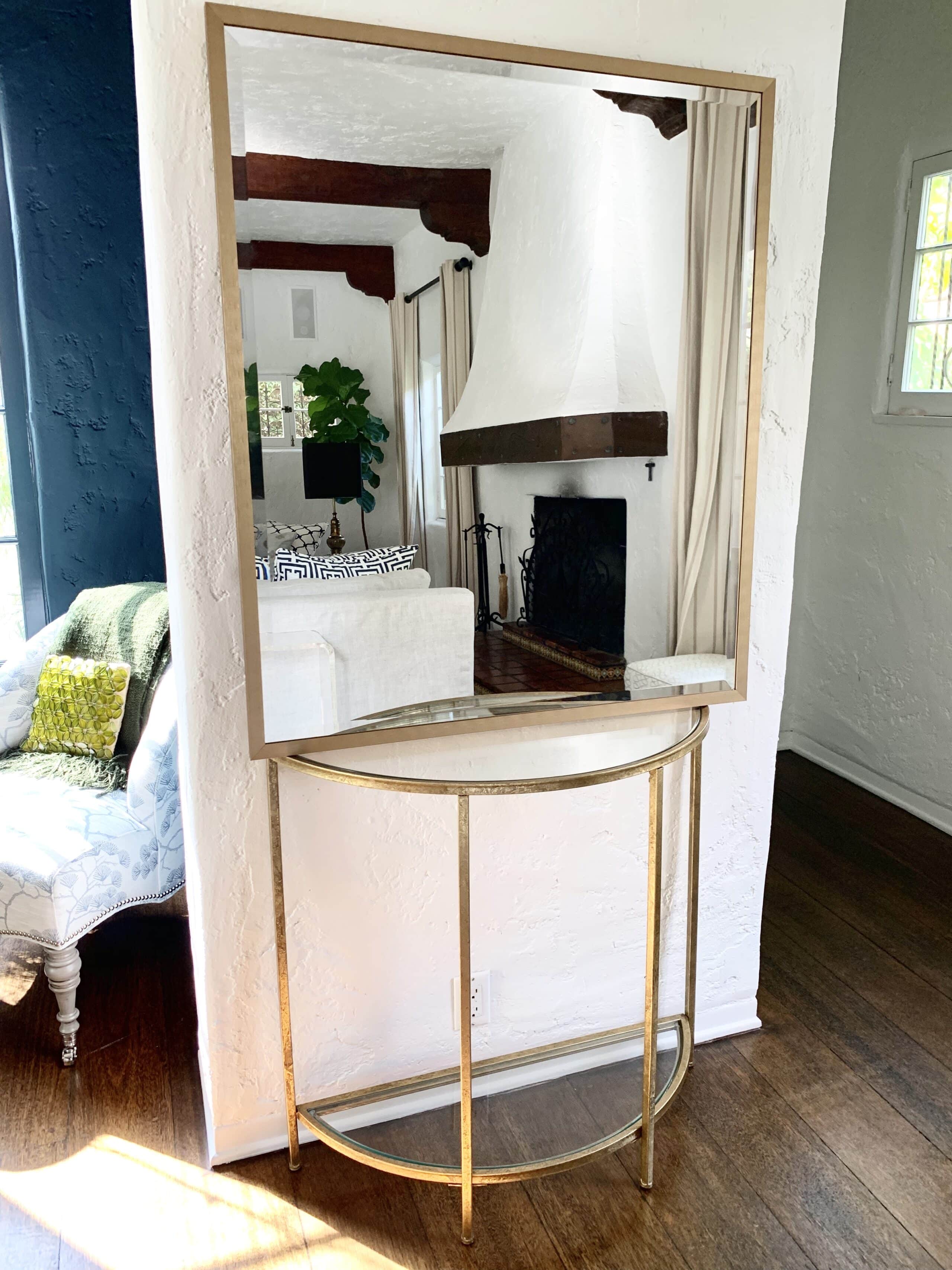
Towards the end of my search, I found this beautiful large scale mirror. Instead of doing a smaller mirror, I decided to pick one that takes up most of the wall to provide the most shimmer. I think that scale is such a huge part of the design. The wrong size of something relative to the space can ruin a design. I thought that a massive very simple gold mirror would give the space a bit of importance without creating visual clutter.

image
share

Then, I started adding in other elements and playing around with placement. 

image
share

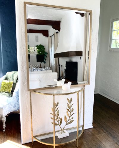
Here I have all of the final elements together. The balance between gold, white, and green is perfectly balanced. I’m thrilled with how this table looks.

BEFORE + AFTER COMPARISON

image
share

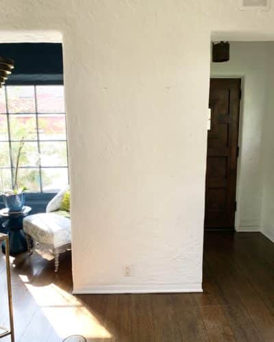
The same before image as earlier – a very basic entryway in desperate need of some love!

image
share

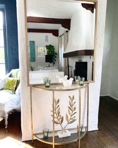
Here it is completed! 

Alt tag for FOYER_MAKEOVER_14
share

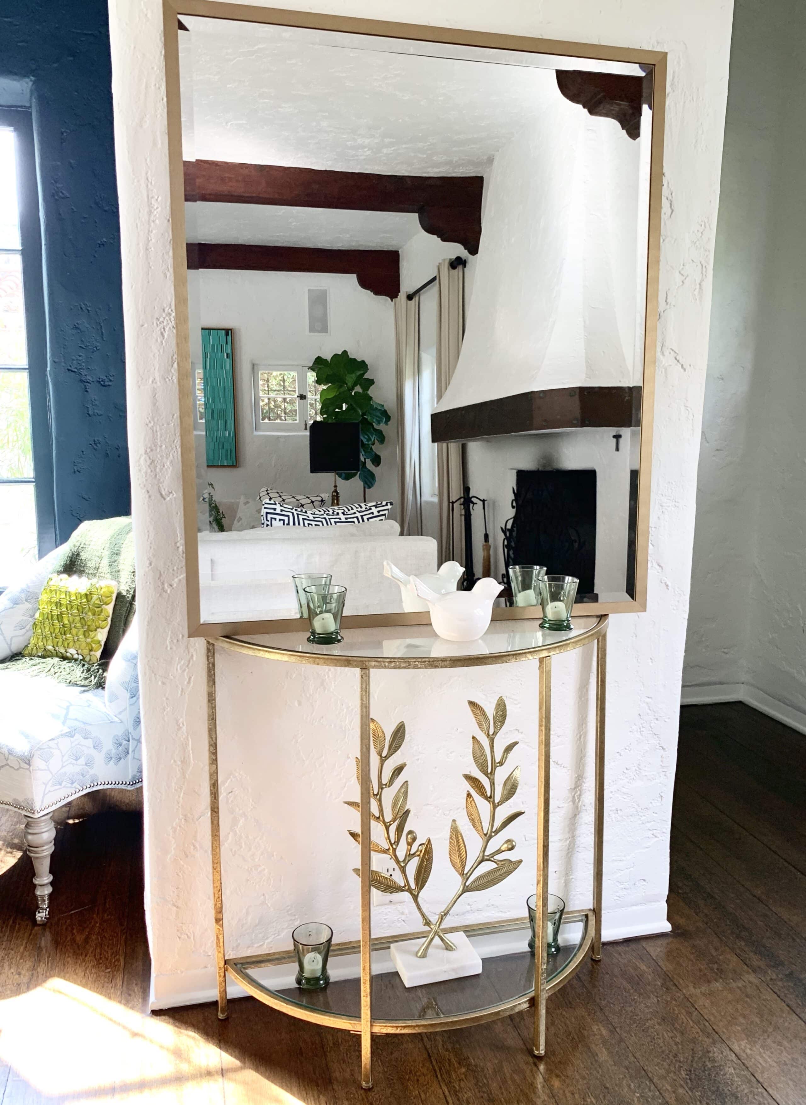
I’m so happy with how it turned out! Now I have a foyer that feels finished and creates a beautiful first impression when entering my home. Every decor item I used is from The Home Depot!

Alt tag for FOYER_MAKEOVER_1
share

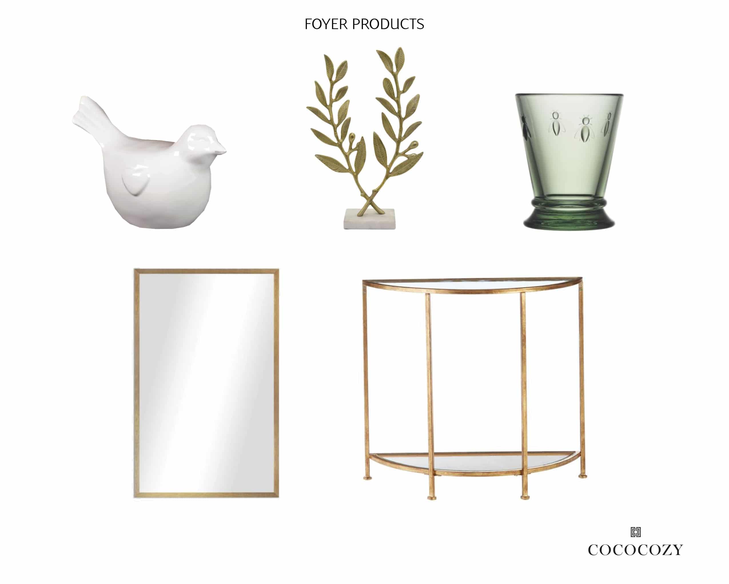
Bird | Leaf Sculpture | Green Glass | Mirror | Console Table

Here are all of the great decor items I used from The Home Depot! I was thrilled when I found this table because it fits so well in the small space. The mirror is fantastic for adding extra light and making the foyer appear larger! The other trinkets remind me of a few things I love. Altogether, the perfect assortment of items to make this space great!

image

This post was created in partnership with The Home Depot. 

What to see more in-home design projects? Check out The COCOCOZY Design House!

DISCLOSURE: This post may contain affiliate links, meaning when you click the links and make a purchase, we receive a commission.
previous
next

related posts

anchor text
anchor text

My Spring Favorites

imageanchor text
imageanchor text
Meet Coco - Bring Style Home

Meet Coco - Bring Style Home

A Los Angeles native, Colette Shelton, also known as “Coco”, is an entrepreneur, design blogger and home furnishings designer.

Read More   read more

Looking for Something?

View All Posts
image

Earn Cash Back While Shopping For Fall

Chirpyest is the shopping platform I created. Using Chirpyest, anyone can earn money by shopping AND for sharing from over 800+ online retailers! Sign up for free! :)

Tap the "join Chirpyest now" link below or the image above to get started making money while you shop!

Join Chirpyest Now
Elegant Sideboard Table

image

Use Chirpyest to get 5% cash back from Lulu & Georgia!
Join our mailing list
Sign Up Now

Recently Pinned

Recently Pinned

Resources

My list of favorite brands and retailers to shop.   Resources
image
write a comment
  • Share

Leave a Reply Cancel reply

Your email address will not be published. Required fields are marked *

This site uses Akismet to reduce spam. Learn how your comment data is processed.

Instagram

A soft touch of pink, layered into the space. Not A soft touch of pink, layered into the space. Not overpowering, just enough to warm everything up, walls, upholstery, even the smallest details.
It shifts the mood completely. Calmer, softer, and a little more lived in.
Save this if you’re leaning toward softer, warmer spaces. 🌸
1. Design: @brianwoulfe 📸 @benandersphotographer
2. @eadieandcrole 📸 @boz_gagovski
3. @amyastley
4. Design: @katie_harbison 📸@helencathcart
5. @carlgergesarchitects
6. Design: @lindsayrhodesinteriors
📸@lelanief⁠
7. Design: @mintysynthinteriors
📸 @lacey_land
What makes the Saint-Martin Apartment in Paris so What makes the Saint-Martin Apartment in Paris so hard to look away from is the deliberate clash Sophie Dries @sophiedries_ created and didn’t try to resolve.
The bones of the apartment are pure Haussmann: ornate cornicing, carved boiserie, a marble fireplace with a gilded mirror. Everything a 19th-century Parisian apartment should be. Then she placed a near-black dining table with brass-legged stools into the middle of it. A raw concrete-look bathroom behind the grandeur. Dark, sculptural objects on surfaces that were built for delicate things.
It works because she didn’t try to blend the two, she let them sit in contrast. The apartment feels lived-in and specific because of it.
→ Save this if you’re mixing old architecture with contemporary furniture.
📸 @stephanjulliard
#interiordesign #parisapartmenttour #parisianstyle #contemporarydesign #interiorarchitecture
From classic to modern, rustic to minimal, the pap From classic to modern, rustic to minimal, the paper lantern just fits. It softens the room, diffuses the light, and rounds out even the sharpest architectural edges without demanding any attention. 🏮
Are you into paper lanterns, or do you prefer a more structured statement light? 🧐
1. Design: @brownstoneboys Photography: @frankfrancesstudio
2. Design: @calicowallpaper Photography: @william.jess.laird
3. @alexanderdesignbuild
4. Design: @emmanuelle_simon Photography: @damiendemedeiros
5. Design: @katie_sargent_design Photography: @gemmola @living_inside_agency
6. Interior Design: @jesseparrislamb
Photography: @katesjordan
7. @christinacolestudio
8. Photography: @annastathakiphoto Design: @anewday_interiordesign
9. Design: brownstoneboys
Photos: @nickglimenakis
Streets of #Paris. 📍 Rue de Castiglione — Laid ouStreets of #Paris. 📍
Rue de Castiglione — Laid out under Napoleon in the early 1800s, this neoclassical street connects Place Vendôme to the Tuileries Garden in one clean, symmetrical line.
Place de Furstenberg — A tucked-away square in Saint-Germain-des-Prés that was once home to the painter Eugène Delacroix, and still feels like little has changed.
Les Antiquaires on Rue du Bac — A street with centuries of history, now best known for its cluster of antique dealers trading in furniture, paintings, and curiosities and home to @les_antiquaires_paris bistro which is an easy spot to grab a bite near the Seine.
Musée du Louvre — Built as a medieval fortress in the 12th century, it became a royal palace, then the world’s most visited museum, home to the Mona Lisa and tens of thousands of other works.
Église Saint-Sulpice — Paris’s second-largest church, with a gnomon installed inside to track the sun’s position and help calculate the liturgical calendar.
Les Deux Magots — The Saint-Germain café where Simone de Beauvoir, Sartre, and Hemingway once gathered, and a lasting symbol of Paris’s literary culture.
Place Vendôme — Commissioned under Louis XIV, this octagonal square is anchored by the Vendôme Column, cast from cannons captured at the Battle of Austerlitz.
Shops, people, and buildings that make you stop for a second and look up. Every corner feels different. Old, detailed, and full of life. Sometimes this is the best part. Just being here. ❤️
#parisjetaime #parisfrance #parisianlife #streetsofparis
Nour Arida’s (@nouraridaofficial) Paris apartment Nour Arida’s (@nouraridaofficial) Paris apartment was designed to feel like a little piece of Beirut — a pied-à-terre that keeps her connected to Lebanon while living in France.
Architect Carl Gerges @carlgergesarchitects built the whole interior around warmth and softness: a caramel sofa, a pink kitchen, milky whites throughout. Nothing sharp, nothing cold. The palette reads as indulgent without trying. It’s the kind of space that feels like it was chosen for comfort first and aesthetics second, even though both are clearly considered.
What’s easy to miss is the restraint underneath it all. The softness works because it’s disciplined. Every piece earns its place in the same tonal story.
→ Save this if you’re building a warm, tonal interior from scratch.
📷 Photography: @ambroisetezenas
🏛 Architecture: @carlgergesarchitects
🪴 Interior styling: @sarahvonsaurma
#paris #interiordesign #apartmenttour #parisianstyle #parisapartments
Follow on Instagram
footer logo

Interiors

  • Kitchen
  • Bath
  • Bedroom
  • Living Room
  • House Tours
  • Outdoor

Style

  • Fashion
  • Best of
  • Travel
  • Design on Sale
  • Coco's Projects

About

  • About Coco
  • Press
  • Contact
  • View All Posts

Join our mailing list

Sign Up Now
© 2026 Cococozy | Terms & Conditions