logo
inline logo
  • Blog
  • Design
    • Kitchen
    • Bath
    • Bedroom
    • Living Room
    • Outdoor Living
  • Style
    • Fashion
    • Best of
    • Design On Sale
  • Projects
  • Travel
  • Shopping Guides
    • Gift Guides
    • Resources
    • Wishlist
  • About Coco
    • Meet Coco
    • Press
    • Contact

What are you looking for?

main logo
  • Blog
  • Design
    • Kitchen
    • Bath
    • Bedroom
    • Living Room
    • Outdoor Living
  • Style
    • Fashion
    • Best of
    • Design On Sale
  • Projects
  • Travel
  • Shopping Guides
    • Gift Guides
    • Resources
    • Wishlist
  • About Coco
    • Meet Coco
    • Press
    • Contact
imagehome
share
Foyer

THIS OR THAT – FOYER DESIGN

May 13, 2013
  • Share
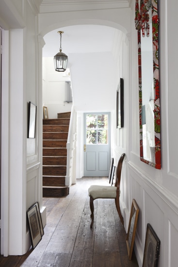
wide plank wood floors foyer entry hall entryway entrance front door light blue decor interior design stairs

What do you think?  Which of these entry halls do you like best…simple “less is more decor” foyer above…or the decked out designed foyer below.

Which would you want to come home to every day?

I love the wide plank wood floors, the pale blue front door and the paneled walls in the first photo.

I also really like the black penny round tile floors, sisal stair case runner, the black framed art and mirrors and the great Madeline Weinrib rug in the photo below.

Hmmm…thinking.
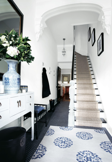
foyer entry hall entryway entrance stairs staircase black penny round tile floors natural fiber sisal seagrass stair staircase rug runner design decor

So…which do you prefer…I have my pick…once you weigh in I’ll let you know what I think tomorrow.

Comment below please!

Happy Monday!

xo
Coco

Photos: Alex James Photography; House & Home

image
DISCLOSURE: This post may contain affiliate links, meaning when you click the links and make a purchase, we receive a commission.
previous
next

related posts

anchor text
anchor text

My Spring Favorites

imageanchor text
imageanchor text
Meet Coco - Bring Style Home

Meet Coco - Bring Style Home

A Los Angeles native, Colette Shelton, also known as “Coco”, is an entrepreneur, design blogger and home furnishings designer.

Read More   read more

Looking for Something?

View All Posts
image

Earn Cash Back While Shopping for Summer

Chirpyest is the shopping platform I created. Using Chirpyest, anyone can earn money by shopping AND for sharing from over 800+ online retailers! Sign up for free! :)

Tap the "join Chirpyest now" link below or the image above to get started making money while you shop!

Join Chirpyest Now
Campo Teak Dining Table
Elegant Sideboard Table

Use Chirpyest to get 7.5% cash back from Terrain!

Join our mailing list
Sign Up Now
Close
Newsletter Sign-Up

Please join our mailing list

Recently Pinned

Recently Pinned

Resources

My list of favorite brands and retailers to shop.   Resources
image
write a comment
  • Share

22 responses to “THIS OR THAT – FOYER DESIGN”

  1. Traci says:
    May 13, 2013 at 10:44 AM

    Definitely the second one. Looks warmer and more inviting.

    Reply
  2. The View from The Back says:
    May 13, 2013 at 10:58 AM

    I’m a fan of the second option. Clean, crisp and functional with my favorite blue and white combination.

    Reply
  3. Anonymous says:
    May 13, 2013 at 11:12 AM

    Different stages….I like both because I am in stage 1 right now….

    Reply
  4. Kim Nelson says:
    May 13, 2013 at 11:33 AM

    I’d create something in between. But if I have to choose, less is always more… #1.

    Reply
  5. Cortney says:
    May 13, 2013 at 11:56 AM

    I love both and actually have the picture of the second foyer saved!!!! I love it so much – so my vote is with number two! Both are nice though.

    Cortney at http://www.organicallyopulent.com

    Reply
  6. Nancie B. says:
    May 13, 2013 at 12:52 PM

    Number one please. Looks more like a place I would like to live in rather than a show place.

    Reply
  7. [email protected] says:
    May 13, 2013 at 1:18 PM

    #1 is nice.. simple in design, I like wall panels.. but personally I prefer foyer #2, for its refinement, architectural detail, picures.. it’s more elegant
    Agnes

    Reply
  8. Anonymous says:
    May 13, 2013 at 1:29 PM

    I don’t think #1 is less at all. There are actually more elements in the room that look cluttered to me; the leaning of the small art on the floor is likely the cause. #2 looks has strong cohesive design voice that looks as if it’s been curated.

    Reply
  9. Courtney says:
    May 13, 2013 at 1:34 PM

    #2 is my pick. I love the high ceilings and architectural detail. When the fixed elements are already amazing, anything else you put with them will look terrific. So, the Madeline Weinrib rug, huge mirror and classic sisal up the stairs…icing on the cake!

    Reply
  10. Karen Albert says:
    May 13, 2013 at 2:11 PM

    The 2nd is me! It is a very welcoming, not too formal, and eclectic foyer! Adore!

    xoxo
    Karena
    Art by Karena

    Reply
  11. Sheila Hallmark says:
    May 13, 2013 at 3:10 PM

    Def the second. I’m not a fan of pics leaning against a wall on the floor. That just looks stupid to me. I love the second one, design rug on the floor and the neutral sisal looking up the stairs. The coat hooks spaced out also are nice and functional, without looking like a wad of coats ( which is why I have!)

    Reply
  12. Revel In It Mag says:
    May 13, 2013 at 4:16 PM

    I am for sure a decked out foyer girl. To me it’s a room and it’s sets the tone for the experience I want to have in my home.

    Reply
  13. MJH DesignArts says:
    May 13, 2013 at 10:06 PM

    I used to be a No.1–East Coast. Now I am definitely No. 2–European chic. That’s said, I love them both.
    Mary

    Reply
  14. maisonmarigold says:
    May 13, 2013 at 10:33 PM

    Love them both (is that the ‘chiang mai dragon’ clad on the mirror frame in the 1st image ??)..but the second one is more my style..its really fabulous..xx meenal

    Reply
  15. Anonymous says:
    May 13, 2013 at 11:18 PM

    I’m voting for #2, very beautiful, but not overboard. It’s got perfect colors, too!

    Reply
  16. Donna Benedetto says:
    May 14, 2013 at 11:20 AM

    #2 is my vote, it looks finished, layered and give and inside peek to
    the homeowner!
    Donna
    thebeneblog.com

    Reply
  17. Anonymous says:
    May 14, 2013 at 2:11 PM

    Totally the second. I am so midwest, the pictures leaning against the floor in the first example look like you have forgotten to place them on the wall! If you are looking for a foyer to welcome you into your home…the second is my choice all the way.

    Reply
  18. Handmade Area Rugs says:
    May 15, 2013 at 5:14 AM

    love it, specially the rug. perfect colors and the vase. thanks for the post.

    Reply
  19. Etherial says:
    May 17, 2013 at 6:25 AM

    No. 2! I reminds me of a real family home with the whole clan visiting for a week with the grandkids, and I’ me and Dad/Grandad are in the kitchen making breakfast before anyone is up.

    No. 1 is for more hippie/chic/minimalist decor. It’s nice, but I need to dress my house to feel at home.

    Reply
  20. Megan says:
    May 21, 2013 at 8:17 AM

    Definitely the first one! So casual, relaxed and comforting. I love it!

    Megan, LushtoBlush.com

    Reply
  21. valvacious says:
    March 12, 2014 at 8:04 AM

    Number 2 is my favorite… but I am claustrophobic and would never live in a place with that narrow of an entrance. My entrance is Big and Wide.

    Reply
  22. janice mcmanus says:
    April 20, 2015 at 7:36 AM

    definitely no. 1

    Reply

Leave a Reply Cancel reply

Your email address will not be published. Required fields are marked *

This site uses Akismet to reduce spam. Learn how your comment data is processed.

Instagram

Light-filled rooms. Views over the Esplanade des I Light-filled rooms. Views over the Esplanade des Invalides. A collection of 20th-century furniture and masterpieces. The Fabert apartment designed by @chahan_m does not miss.
Save for when you need serious French design inspo and follow for more. 🤍
📍Paris, France
#parisapartment #parisinteriors #apartmentdesign #luxuryinteriors #designinspiration
A great parquet floor doesn’t just ground a room. A great parquet floor doesn’t just ground a room. It tells you everything about the history of the space. The patina, the pattern, the way light moves across it. These are the rooms that prove good bones never go out of style.
What’s your favorite parquet pattern?
Save this for your next renovation inspo and follow for more. 🖤
@dorotheemeilichzon | 2 & 7 @abkasha 📷 @sebastien_dondain | @tristanauer | @lichelle.silvestry.interiors | @jfy.designs | @anthology_creative_studio | @helenehoue
A Haussmannian shell. A sculpture gallery inside i A Haussmannian shell. A sculpture gallery inside it.
Designer Emma Donnersberg took her own Paris apartment in the 7th arrondissement and used it to rewrite the rules — classical bones, contemporary everything else. Her Wave Sofa and U&Me Table anchor the living room in organic curves. In the kitchen, a green ceramic-wrapped island does the heavy lifting for color against all that neutral stone. And the dining room? A Carrara travertine fireplace that turns stone into the whole point of the room.
Curved, curated, and completely hers. 🤍
Save this for your next renovation moodboard.
📍 Paris, 7th arrondissement
🏡 Design: @emma.donnersberg
📸 @alicemesguich
A balcony this beautiful deserves a tour. 🤍 A litA balcony this beautiful deserves a tour. 🤍
A little peek at one of my favorite outdoor spaces, which I designed years ago. The patterned tile, navy seating, white stucco, and layers of greenery make this balcony feel like a little room all its own.
I love how much personality you can create in a small outdoor space without making it feel overcrowded.
Save this for your next outdoor space refresh. 🍃
#balconydecor #balconytour #homedecorinspo
Want a bedroom that feels cozy, warm, and invitingWant a bedroom that feels cozy, warm, and inviting? Start with these simple changes:
1. Layer your bedding. Mix sheets, a duvet, quilts, and throw blankets to create that plush, lived-in look.
2. Add warm lighting. Swap harsh overhead lighting for bedside lamps, sconces, or a statement light with a warm glow.
3. Bring in plenty of texture. Think linen, velvet, boucle, chunky knits, and soft rugs.
4. Keep the palette warm and calming. Soft neutrals, earthy tones, and muted colors instantly make a room feel more restful.
5. Mix in natural materials. Wood, rattan, woven accents, and stone add warmth and character.
6. Make the walls feel personal. Art, photographs, or even a statement headboard can make the room feel more finished.
7. Add something organic. A vase of branches, fresh flowers, or a little greenery can bring the room to life.
The goal isn’t to make your bedroom perfect. It’s to make it feel like a place you actually want to retreat to at the end of the day.
Save this for your next bedroom refresh. 🤎
#interiordesign #homedecor #bedroomdesignideas #bedroominspiration #cococozy
Follow on Instagram
footer logo

Interiors

  • Kitchen
  • Bath
  • Bedroom
  • Living Room
  • House Tours
  • Outdoor

Style

  • Fashion
  • Best of
  • Travel
  • Design on Sale
  • Coco's Projects

About

  • About Coco
  • Press
  • Contact
  • View All Posts

Join our mailing list

Sign Up Now
© 2026 Cococozy | Terms & Conditions