logo
inline logo
  • Blog
  • Design
    • Kitchen
    • Bath
    • Bedroom
    • Living Room
    • Outdoor Living
  • Style
    • Fashion
    • Best of
    • Design On Sale
  • Projects
  • Travel
  • Shopping Guides
    • Gift Guides
    • Resources
    • Wishlist
  • About Coco
    • Meet Coco
    • Press
    • Contact

What are you looking for?

main logo
  • Blog
  • Design
    • Kitchen
    • Bath
    • Bedroom
    • Living Room
    • Outdoor Living
  • Style
    • Fashion
    • Best of
    • Design On Sale
  • Projects
  • Travel
  • Shopping Guides
    • Gift Guides
    • Resources
    • Wishlist
  • About Coco
    • Meet Coco
    • Press
    • Contact
imagehome
share
Kitchen

THIS OR THAT: MOSAIC KITCHEN BACKSPLASH!

February 12, 2013
  • Share
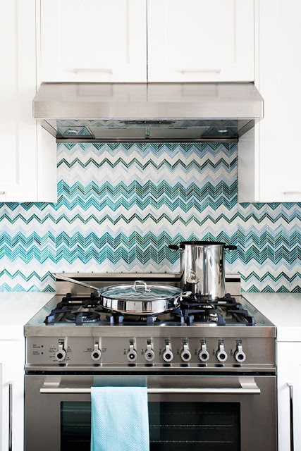
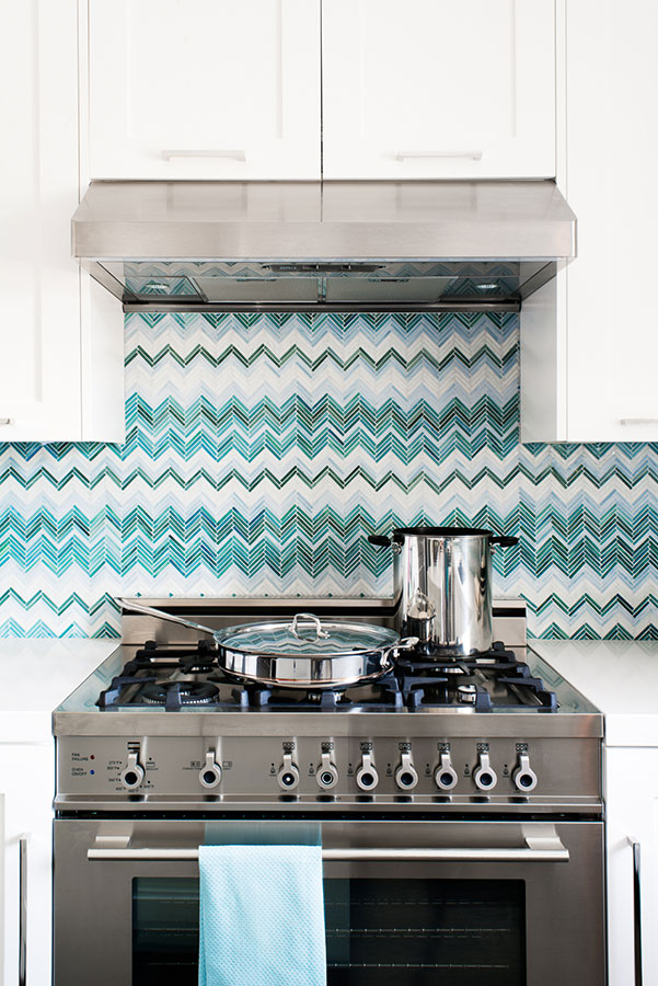
close up in blue and white zig zag chevron tiles, white cabinets and polished metal stove in a kitchen by Jute

Which of these two kitchen looks do you like better.

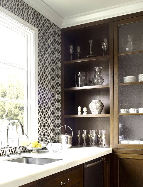
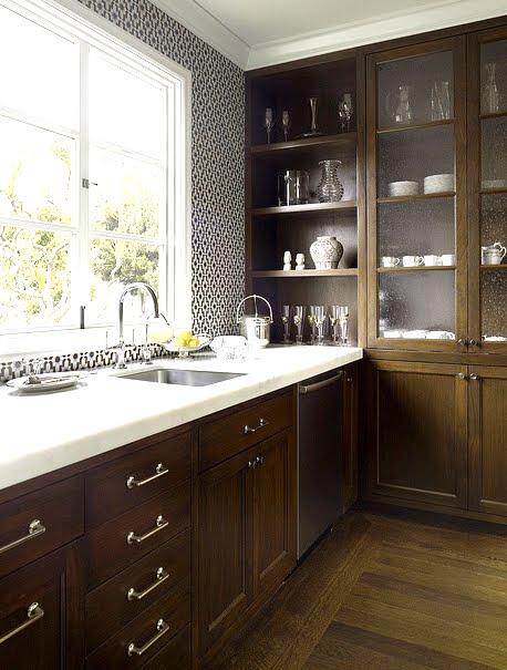
The white kitchen with the blue mosaic chevron pattern backsplash?  Or the kitchen with the dark wood cabinets and the Moorish looking mosaic tile backsplash?

Which do you prefer.

THIS?

kitchen with blue and white zig zag chevron tiles, white cabinets and center island, polished metal stove, french door refrigerators and a chalkboard wall by Jute

OR THAT?

Close up of a kitchen with black and white Moroccan tiles, wood cabinets and white marble counter tops by House of Fifty
Kitchen with black and white Moroccan tiles, wood cabinets and white marble counter tops by House of Fifty

I like both kitchens definitely! But if I had to pick a look for my house…it is tough but I would pick the 2nd kitchen if you can believe! Normally I always lean towards the light and bright so picking #2 is truly a departure!

What do you think?  If you had to scoop up one of these kitchens and put it in your own home…which would you take? Please vote in the comments below!

Happy Tuesday!

xo
Coco

P.S. Had a lovely dinner at Dominick’s last night JLF.

Photos: Jute; House of Fifty

image
DISCLOSURE: This post may contain affiliate links, meaning when you click the links and make a purchase, we receive a commission.
previous
next

related posts

anchor text
anchor text

My Spring Favorites

imageanchor text
imageanchor text
Meet Coco - Bring Style Home

Meet Coco - Bring Style Home

A Los Angeles native, Colette Shelton, also known as “Coco”, is an entrepreneur, design blogger and home furnishings designer.

Read More   read more

Looking for Something?

View All Posts
image

Earn Cash Back While Shopping for Summer

Chirpyest is the shopping platform I created. Using Chirpyest, anyone can earn money by shopping AND for sharing from over 800+ online retailers! Sign up for free! :)

Tap the "join Chirpyest now" link below or the image above to get started making money while you shop!

Join Chirpyest Now
Campo Teak Dining Table
Elegant Sideboard Table

Use Chirpyest to get 7.5% cash back from Terrain!

Join our mailing list
Sign Up Now
Close
Newsletter Sign-Up

Please join our mailing list

Recently Pinned

Recently Pinned

Resources

My list of favorite brands and retailers to shop.   Resources
image
write a comment
  • Share

16 responses to “THIS OR THAT: MOSAIC KITCHEN BACKSPLASH!”

  1. Leslie B. says:
    February 12, 2013 at 12:03 PM

    I love them both! I love the blues in the first photo but the simplicity of black and white never goes out of style.

    Reply
  2. Nancie Bee says:
    February 12, 2013 at 1:54 PM

    Definitely no. 2. The first one reminds me of that BArgello stitch needlepoint pattern that was so popular in the 70s. In other words-it looks dated, not timeless.

    Reply
  3. Marcela Barraza says:
    February 12, 2013 at 2:12 PM

    I like No. 2. Simple, elegant, cozy!
    xo,
    Marcela

    Reply
  4. penny says:
    February 12, 2013 at 3:56 PM

    Number 2…love the colors in the first but I’m afraid the pattern would make me a little dizzy…still, I really like it, but number 2 feels really good to me (and I don’t normally like wood tone cabinets).

    Reply
  5. JuliaSmith says:
    February 13, 2013 at 1:27 AM

    it looks beautiful….,I loved this post……..Architects in India

    Reply
  6. Citizen Frederick says:
    February 13, 2013 at 7:03 AM

    Number 1, all the way. Thanks for the inspiration. I’ll consider it in my kitchen remodel.

    http://www.citizenfrederick.com

    Reply
  7. Allie says:
    February 13, 2013 at 7:42 AM

    #1 has me hooked! I love it!

    Reply
  8. Courtney says:
    February 13, 2013 at 10:17 AM

    Both beautiful, but #2 might be a bit more timeless…in my opinion, of course! 🙂

    Reply
  9. The View from The Back says:
    February 13, 2013 at 10:52 AM

    #2 Definitely.

    Reply
  10. MyDesignSource says:
    February 13, 2013 at 10:57 AM

    I love ‘that’. Class colors, a great pattern and rich wood is too hard to refuse.

    Reply
  11. Debbie Zimmer says:
    February 13, 2013 at 2:34 PM

    Looking at the pictures I would say the first one… but seeing it in person I would probably go with the second for sure- they are both great though!

    Reply
  12. Maryanne White says:
    February 13, 2013 at 3:35 PM

    Absolutely #2, so much less of a commitment. The pattern and color can go in many directions, something I feel is important with something so permanent

    Reply
  13. JASAPROYEK.COM says:
    February 13, 2013 at 6:15 PM

    Very impressive

    I Like it 🙂

    by: JasaProyek.com

    Reply
  14. Anonymous says:
    February 14, 2013 at 7:46 AM

    Love #2!

    Reply
  15. Josh Urso Design says:
    February 15, 2013 at 8:02 AM

    The ikat-inspired tile is beautiful and fresh and certainly on trend in number 1 but the design is maybe little too trendy for our taste. Who wants to live through a kitchen remodel every 5 years? Number 2 is interesting and classic and has a more personal feel.

    Reply
  16. Gina says:
    May 14, 2017 at 11:28 AM

    They’re both gorgeous! But I really love the second one. Please tell me where to find it as I have been searching for months!!

    Reply

Leave a Reply Cancel reply

Your email address will not be published. Required fields are marked *

This site uses Akismet to reduce spam. Learn how your comment data is processed.

Instagram

Drapes or no drapes? 👀 One room, two very differe Drapes or no drapes? 👀
One room, two very different feelings.
Without the drapes, the space feels bright, open, and minimal. Add the drapes, and suddenly there’s more softness, warmth, and texture.
This was one of the details we loved playing with in the COCOCOZY Design House. Sometimes a simple window treatment can completely change the feeling of a room.
Which would you choose for this space: WITH DRAPES or WITHOUT? Tell us below. 🤍
Paint gets all the credit. Wallpaper does the actu Paint gets all the credit. Wallpaper does the actual work.
Delicate florals in a powder room, a full-envelope ikat entry, a moody botanical pantry, a pattern bold enough to wear the whole room — six spaces, zero fear of commitment.
Which one would you live with every day? Drop your answer 👇
@kimspradlinwolfe | @heidihoudekinteriors 📸: @madelineharperphoto | @mbsullivandesign 📸: @madelineharperphoto | @heidicaillierdesign | @ericaburnsinteriors | @deborahlundinteriors
A dining room should make people want to stay past A dining room should make people want to stay past dessert.
Seven rooms that all get the basics right: good light, a table with presence, chairs you’d actually want to sit in for two hours.
Which one would you set the table in tonight? 👇
@annaknightinteriors | @haas_design | @kinteriors_sf | @jeremiahbrent | 5 & 6 @hilarymattinteriors | @alissajohnsoninteriors
Your bed is about to get a whole lot cozier. 👀 SoYour bed is about to get a whole lot cozier. 👀
Something COCOCOZY is coming to Costco very soon.
Consider this your sign to get your bedroom ready. ✨
Stay tuned!
#cococozy #comingsoon‼️ #costcodeals
Alexis Banks Humiston didn’t just design this 9,20 Alexis Banks Humiston didn’t just design this 9,200 sq ft Nashville home, she moved in with the family for two days first.
She interviewed everyone, including the 6 and 8-year-olds, before touching a wall. The payoff shows up in the details: a hand-painted constellation ceiling in the son’s room by @willemrackestudio, a floral canopy bed for the daughter, and a hidden reclaimed-wood bar tucked into the attic eaves.
Every room feels like it was made to be lived in, not admired.
📸 @jennapeffley | Design: @abhinteriors | As featured in @housebeautiful
Follow on Instagram
footer logo

Interiors

  • Kitchen
  • Bath
  • Bedroom
  • Living Room
  • House Tours
  • Outdoor

Style

  • Fashion
  • Best of
  • Travel
  • Design on Sale
  • Coco's Projects

About

  • About Coco
  • Press
  • Contact
  • View All Posts

Join our mailing list

Sign Up Now
© 2026 Cococozy | Terms & Conditions