logo
inline logo
  • Blog
  • Design
    • Kitchen
    • Bath
    • Bedroom
    • Living Room
    • Outdoor Living
  • Style
    • Fashion
    • Best of
    • Design On Sale
  • Projects
  • Travel
  • Shopping Guides
    • Gift Guides
    • Resources
    • Wishlist
  • About Coco
    • Meet Coco
    • Press
    • Contact

What are you looking for?

main logo
  • Blog
  • Design
    • Kitchen
    • Bath
    • Bedroom
    • Living Room
    • Outdoor Living
  • Style
    • Fashion
    • Best of
    • Design On Sale
  • Projects
  • Travel
  • Shopping Guides
    • Gift Guides
    • Resources
    • Wishlist
  • About Coco
    • Meet Coco
    • Press
    • Contact
imagehome
share
Kitchen

Kitchen With Jet Black Lower Cabinets and Marble Countertops

February 24, 2012
  • Share
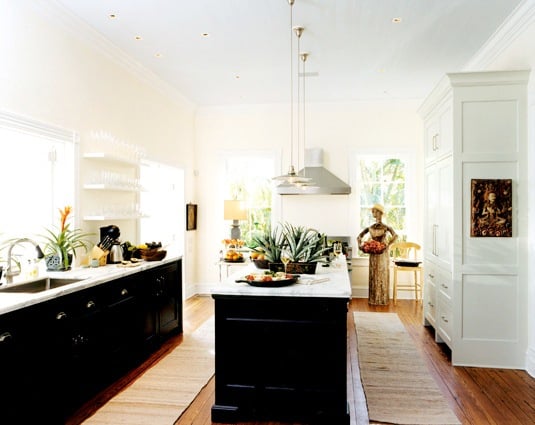
Kitchen with jet black lower cabinets, marble countertops, floating shelves instead of upper cabinets and pendant lights
Kitchen with jet black glossy lower cabinets and marble countertops with only floating shelves as upper cabinets. (above)

Kitchen Design with Black Lower Cabinets

I wonder if what holds true in fashion holds true for kitchens?  Since a pair of black slacks are a staple in women’s fashion. Then doesn’t it make sense for black lower cabinets to become a kitchen staple? I know…most of you who read regularly are like here she goes again. But this is a coy and mysterious month…so I’m not wondering out loud too much.

Dark Color Lower Cabinets

For example, in fashion, if you should happen to have a larger bottom than top (not necessarily saying that is the case with moi, I’m just speaking hypothetically…sort of…kind of…), wearing darker colors on the bottom (pants, skirts) makes one look skinnier on that part of the body.

Skinny Kitchen Design

Do kitchens look less fat with dark lower cabinets? Do kitchens ever say “does my bottom half look big today?” Hmmm…food for thought…?  (These are the times my mother wonders I’m sure…”Why did I pay thousands of dollars for Coco’s education?  What happened here?  Why is she pretending a kitchen can speak or cares about what it looks like on the bottom?  What went wrong here? Why can’t she pose some truly thoughtful important questions.?”  Sorry mom…LOL)

In all seriousness, or in semi-seriousness, I like a two-toned kitchen. Dark lower cabinets and light or no upper cabinets. Makes even the most traditional kitchens look a little more modern I think.

Best Base Cabinet Colors

Having a dark base cabinet has become a popular trend in kitchen designs. But which colors are the best? We all want a complement kitchen that gives us that “wow” factor. A two-toned kitchen will always look more elevated (when done properly).

According to Architectural Digest, the top base cabinet colors include:

  1. Farrow & Ball Pointing (No. 2003)

  2. Sherwin-Williams Origami White (SW 7636)

  3. Benjamin Moore Simply White (OC-117)

  4. Benjamin Moore Backwoods (469)

  5. Benjamin Moore Bruton White (CW-710)

  6. Sherwin-Williams Black Magic (SW 6991)

THIS OR THAT: SKINNY KITCHENS!

So in today’s THIS OR THAT I ask, which of these kitchens looks best?
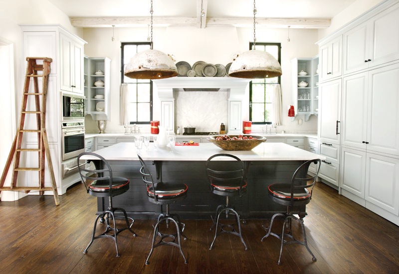
Kitchen with a large island that blends in with the dark wood floors, worn metal over sized pendant lights, white cabinets, and stainless appliances
A large kitchen island blends with the dark wood floors in this industrial classic kitchen (I love the worn metal over sized pendant lights too)(above)
Small kitchen with dark oak cabinets and black poured synthetic cement like counters
Custom dark oak cabinets and black poured synthetic cement like counters make for a very sleek bottom in this modern small kitchen. (above)
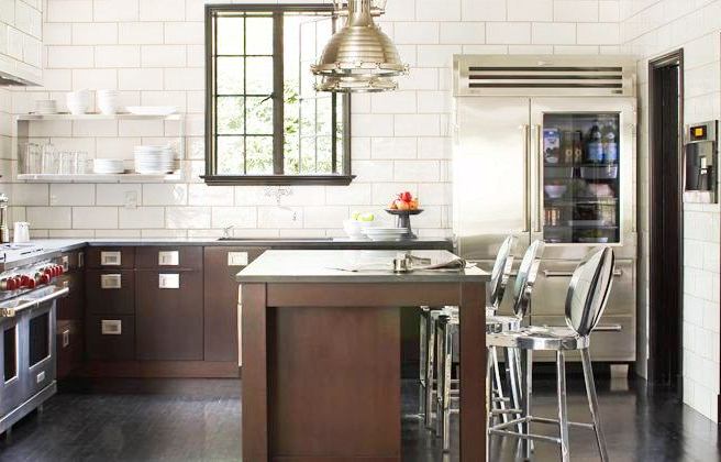
Kitchen with subway tiles walls,dark brown wood lower cabinets with matching island, stainless appliances and metal pendant lights
Dark brown wood lower cabinets do the skinny kitchen look trick too! 🙂 (above)

So do you like this kitchen look dear readers – dark bottom/light top?  If so, which do you like best?  If not, which do you dislike least?  This one, that one, that one or that?  I l like the first the best…love the high gloss almost black lacquer lower cabinets!  Which is your favorite?

Happy Friday!

xo
Coco

P.S. It is Oscar weekend! Are you planning on watching the Academy Awards? I’m not necessarily planning to watch and I live in L.A.!  We’ll see…peer pressure might get to me on this one.

Photos: Malcome James Kutner; Atlanta Homes Magazine; Elle Decor; Jeff Herr Photography

image
DISCLOSURE: This post may contain affiliate links, meaning when you click the links and make a purchase, we receive a commission.
previous
next

related posts

anchor text
anchor text

My Spring Favorites

imageanchor text
imageanchor text
Meet Coco - Bring Style Home

Meet Coco - Bring Style Home

A Los Angeles native, Colette Shelton, also known as “Coco”, is an entrepreneur, design blogger and home furnishings designer.

Read More   read more

Looking for Something?

View All Posts
image

Earn Cash Back While Shopping for Summer

Chirpyest is the shopping platform I created. Using Chirpyest, anyone can earn money by shopping AND for sharing from over 800+ online retailers! Sign up for free! :)

Tap the "join Chirpyest now" link below or the image above to get started making money while you shop!

Join Chirpyest Now
Campo Teak Dining Table
Elegant Sideboard Table

Use Chirpyest to get 7.5% cash back from Terrain!

Join our mailing list
Sign Up Now
Close
Newsletter Sign-Up

Please join our mailing list

Recently Pinned

Recently Pinned

Resources

My list of favorite brands and retailers to shop.   Resources
image
write a comment
  • Share

11 responses to “Kitchen With Jet Black Lower Cabinets and Marble Countertops”

  1. Valerie@DesignCaller says:
    February 24, 2012 at 12:56 PM

    Great post! The first kitchen is my favorite, I can totally relate to musings about fat or thin as it relates to kitchens, and I would love to find a kitchen design that MAKES food-lovers like me skinny. Or tries to.
    🙂
    Valerie

    Reply
  2. Kate says:
    February 24, 2012 at 1:37 PM

    i love the first one, its gorgeous!!! As for the skinny/fat um… I don’t think so perhaps it should read stylish or wrong, that last kitchen is wrong imo 🙂 love your work Coco & I’ll bet your Mumvis proud!

    Reply
  3. Crissy @ House of Marlowe says:
    February 24, 2012 at 1:41 PM

    My favorite is the first one. Love the black. Thanks for the laugh!

    Reply
  4. TwoThirtyFiveDesigns says:
    February 24, 2012 at 2:34 PM

    LOVE LOVE LOVE all pictured, but my fav is the first two…I can have two, right?? Totally digging the bottom being black and/or gray

    Reply
  5. PoppDesign says:
    February 24, 2012 at 3:21 PM

    I love the first one. Dark and glossy lacquer cabinets with a light colored marble countertop. Sleek and beautiful!

    Reply
  6. Carol says:
    February 24, 2012 at 8:50 PM

    The second one – love the dark floors, lights, open cabinets, lg. island and barstools – great layout!

    Reply
  7. catherine says:
    February 25, 2012 at 6:38 AM

    Coco – I am addicted to your blog! I have been pinning you like mad. This is a huge complement (if I do say so myself) because I find most blogs to be a bit sophomoric. Great selection of kitchens. I love the second one! In my pin I said that this kitchen evokes massive envy in my “junk addiction”. Gorgeous use of everyday and not glamorous objects.

    Reply
  8. the designers muse says:
    February 25, 2012 at 8:36 AM

    As an architect, you think about things like gravity and weight. Even though anything is possible with engineering…in traditional design, things always look better if they have “weight” on the bottom and lightness above. Dark colors give a sense of weight…so I think it feels more “correct” to have the darker colored cabinets below and lighter colored cabinets above. Have you found many examples of the opposite? My guess is that in a traditional context, it wouldn’t look great. However if you are trying to design something that feels very modern or weightless…you might try it.

    Reply
  9. Scandi Coast Home Australia says:
    February 26, 2012 at 5:54 PM

    I absolutely LoVe everything about Picture 2……I could LiVe there…
    ……………………………….
    Tania Maree xx

    Reply
  10. pve design says:
    February 27, 2012 at 9:53 AM

    My kitchen looks very much like this….the inspiration was a dark bottom and a light top.
    I can send you some images if you like ~
    pve

    Reply
  11. LiveLaughDecorate says:
    February 27, 2012 at 11:28 AM

    Loves me a mixed tone kitchen! But hmmm, I don’t think kitchens have to worry about wearing a darker color on the lower half to tone down the package, so to speak. lol. The first is my fave but I gotta say, as much as I love open shelving in kitchens, it may look good on paper but is rather impractical i.e. all those open glasses, bowls are dust collectors so you’ll have to rinse those bad boys out every time ya need em. Too much of a hassle.

    Reply

Leave a Reply Cancel reply

Your email address will not be published. Required fields are marked *

This site uses Akismet to reduce spam. Learn how your comment data is processed.

Instagram

Before you start moving furniture, ask yourself thBefore you start moving furniture, ask yourself these three questions:
Does this improve the room’s function?
Does it create a better focal point?
Does it make the space easier to walk through?
If the answer is “no” to all three, maybe it’s just the rearranging itch talking. 😅
Save this for the next time you’re tempted to move every piece of furniture in your house.
Watch to the end to weigh in. Clogs or no clogs? TWatch to the end to weigh in. Clogs or no clogs? They are on sale...not sure.
Summer sale season is here, and we are not holding back. 👏
This is the time of year to finally grab those pieces you’ve been eyeing all season. The good news? Major markdowns are happening right now across some of the best brands.
Our tip: Shop with intention. Know your palette, know your fit, and choose pieces that work with what you already own, not just because they’re on sale.
We’ve already done the hard work and created a Summer Sale Shopping Board filled with our favorite finds. A Shopping Board is like your own storefront. It’s a curated collection of products you can shop yourself or share with others to earn when they purchase through your links.
✨ Want to make it yours?
Comment SALE and we’ll send you the link. Then just tap “Add This Board” to save it to your Chirpyest account.
Or grab the link here 👉 https://www.chirpyest.com/s/cocoedit/summer-sale-2026/2071?mode=share
From there, you can shop the collection, share it with your audience, earn from your recommendations, and get cashback on your own purchases. 💛
This is the house that stopped us mid-scroll and k This is the house that stopped us mid-scroll and kept us there.
A 90s home in Amman, Jordan, entirely remodelled by local artisans. Neo-Florentine bones, Levant-eclectic sensibility, arched passageways, and a flea-market-meets-commissioned-art collection that makes every wall feel intentional.
What makes it work: restraint where you’d expect excess, and boldness where you’d expect safety.
This is what happens when a home is built by people who actually know the place. 🖤
Save this, it’s a masterclass in culturally rooted design.
Design: @tristanauer
📷: @amaurylaparra
#housetours #beautifulhomesfeature #interiordesigninspo
Your mom’s coming over and suddenly every room neeYour mom’s coming over and suddenly every room needs to be perfect. 🤣
Panic mode activated!
If you only have 10 minutes, focus on these three things:
1. Make the bed. It instantly makes the whole room look cleaner.
2. Fold or straighten the throw blanket and pillows.
3. Clear visible clutter from nightstands and the floor.
That’s it. Those three steps make the biggest visual impact without deep cleaning.
Save this for the next time you need a fast bedroom reset. 🔖
Which room would you go black in first? Drop your Which room would you go black in first? Drop your answer 👇
A — The kitchen
B — The bathroom
C — The living room
D — Somewhere unexpected
Black is not a bold choice. It’s a neutral, and one of the most versatile ones in design.
The rooms that get it right treat black the same way others treat white or greige: as a foundation that lets everything else breathe. The texture of the wall. The warmth of the wood. The drama of the marble. Black doesn’t compete, it amplifies.
Save this the next time someone talks you out of going dark. 🖤
@steveandfilip 📷 @rymcdon | @seanandersondesign (2&3) | @jpzinteriors | @coletteinteriors | @ashleymartinhome
Follow on Instagram
footer logo

Interiors

  • Kitchen
  • Bath
  • Bedroom
  • Living Room
  • House Tours
  • Outdoor

Style

  • Fashion
  • Best of
  • Travel
  • Design on Sale
  • Coco's Projects

About

  • About Coco
  • Press
  • Contact
  • View All Posts

Join our mailing list

Sign Up Now
© 2026 Cococozy | Terms & Conditions