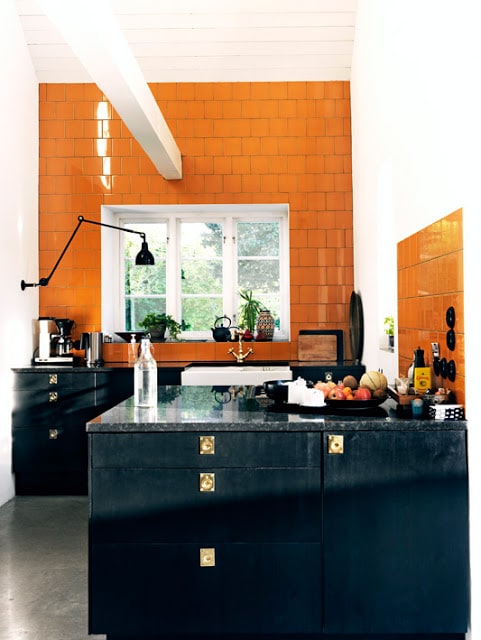
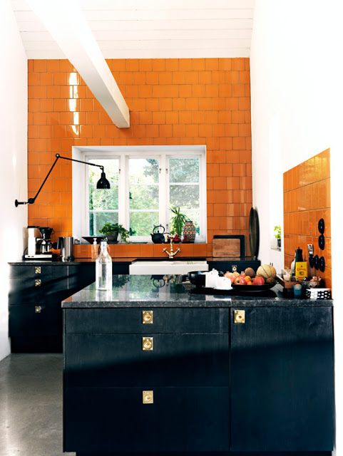
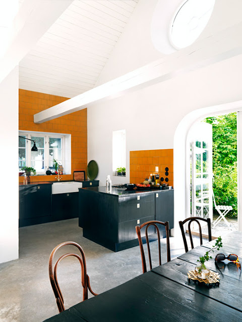
What a darling small kitchen I think. Shiny square Hermes orange ceramic wall tiles, black cabinetry with gold pulls and knobs. Love the white farmhouse sink and gold faucet. It all works.
Using orange tiles on the walls all the way to the ceiling and as a backsplash sounds like bold and risky combination in a kitchen but actually comes of quite well.
Love the architecture of the whole space with the high pitched ceilings, oval skylight and french doors. A very bright and cheerful way to start off the week.
What do you think of these of orange tiles in the space? Is this a design “risk” you would ever take? Please let me know in the comments below!
Happy Monday!
xo
Coco
Photos: J. Ingerstedt






Hmm -i think it’s one of those things that photographs well but might seem a bit…strange in person.
I love each of the elements separately. I think it looks fine all together, but I feel the look will look dated very quickly.
SKT NYC
I keep looking at it and have decided it either needs more orange tile or less of them. The balance is wrong for me. It’s gutsy and attractive in so many ways.
It certainly gets your attention. I’m not sure I would want this in my home – I tend to lean toward safe rather than bold and daring.
I tend to agree with the other responses. The bright white seems a bit distracting with the orange and black. It is cute though, and certainly captures your attention.
I also agree with the other responses…already dated in my mind!
I think it looks beautiful, but I would never attempt it only because I would hate it in no time. I also think they should have done the tile only on the back wall and skipped it on the side wall just looks funny there to me.