Photos in this post by Coco of Cococozy
A Hollywood executive’s very chic and very functional recently remodeled gourmet kitchen. (above)
Was thrilled when a few weeks ago, the super talented Tom Newman of Los Angeles-based architectural firm Newman & Wolen said he had just completed a kitchen remodel that I might find interesting. I love Tom’s work and have featured his amazing designs on COCOCOZY in the past. He has a great sense of space, design, functionality and aesthetics. I wish I had some extra money…I would buy a big house (a fixer upper perhaps) and then have Tom Newman design the entire space!
This kitchen belongs to entertainment executive Christine Birch. Christine has lived in her Los Angeles home for 13 years…and has lived with a kitchen that was desperately in need of a remodel.
Christine met Tom through his partner Ricky Strauss. After being friends for years, Christine turned to Tom to design her new kitchen. Christine loves to cook and coincidentally so does design expert Tom. So it was with cooking in common, the deal was sealed between homeowner and design expert for this kitchen remodel. Christine knew that with a talent for making spaces beautiful and with his love of cooking, Tom was the perfect person to hire to for this design project….and so the tale of two cooks and an incredible kitchen makeover begins …
In today’s mega COCOCOZY Q&A, architect Tom Newman and his client Christine Birch tell me about how they worked together to create a high style and extremely functional kitchen – in a style Tom calls “new traditional”!
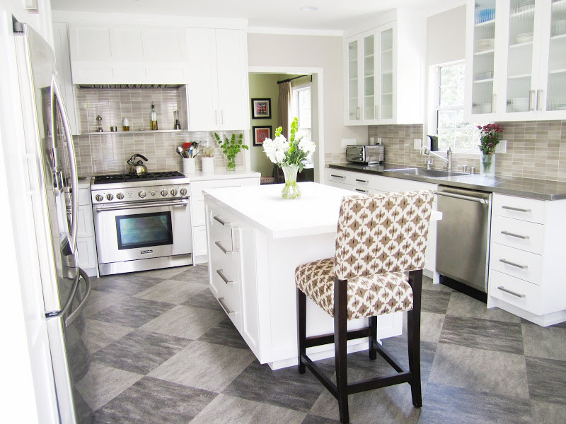
The kitchen is steeped in sophistication with a stainless steel chef quality Thermador oven, grey/brown backsplash and simply elegant white paneled cabinets and hood. (above)
COCO: When you first saw the kitchen before the remodel, what was your first thought?
TOM NEWMAN, NEWMAN & WOLEN (TOM): At first sighting, the kitchen looked like the product of a contractor-owner who wanted to cheaply make the room pretty for resale. The materials and cabinets were simple but unimaginative. The room was functional and had all the essential parts and pieces, but it lacked style. Christine made the best with it that she could.
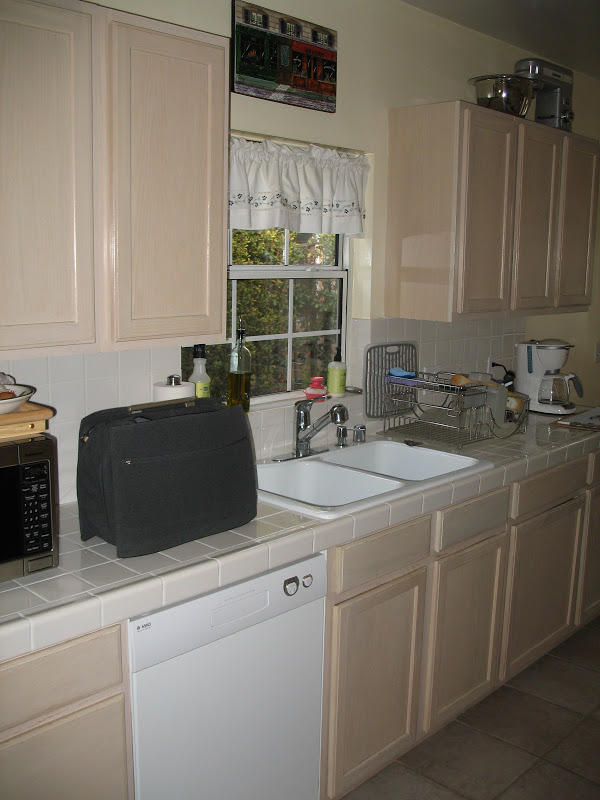
Before, Christine’s kitchen was just blah. It was narrow, dark and had old cabinets and inconveniently tiled countertops. (above).
COCO: What was the most challenging in the design of this kitchen?
TOM: The room was ‘L’ shape due to the unfortunate location of an awkward skinny laundry room. ‘L’ shaped rooms are very difficult. Finding a good place to move the laundry was the biggest challenge. Next was changing the circulation pattern of the house and convincing Christine that she could live better with that change. She used to be able to go directly from the kitchen into her bedroom/office. While that may be convenient when she is alone, it’s not great when entertaining to have her bedroom directly off the kitchen was little separation. It’s hard to make a grand entrance when they’ve already seen you in a robe.
COCO: What were your goals for this project?
CHRISTINE BIRCH, TOM’S CLIENT/HOMEOWNER (CHRISTINE): It was very important to me to combine strong functionality with a beautiful and welcoming social space. Because I love to cook, I needed lots of storage space for kitchen tools of all shapes and sizes. I needed everything to have a place it belonged. At the same time, I wanted it to feel comfortable enough for me to relax in and for guests to hang out in. I had in my mind the idea that the kitchen should become the center of the house, the place from which all activity — except sleeping — emanated. We also wanted to make the master suite more private, by closing it off to general foot traffic.
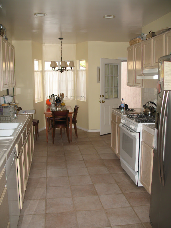
Before, old kitchen was long and narrow.(above)
COCO: Where did you see “design opportunities” when mapping out your plan?
TOM: Once I was able to open up the room into a nice rectangle (getting rid of the ‘L’ shape), it created a world of possibilities.
After, the kitchen is open and airy with a center island, breakfast nook and all of the amenities an avid cook would want! (above)
COCO: After hearing what Christine was hoping for in a kitchen, how did you approach your design of the space?
TOM: Christine wanted lots of openness, light, and simplicity. A big open room with a center island and skylight could make that happen. It was also a pleasure to design a kitchen for someone that cooks. She knew what she wanted in terms of appliances and work areas, and she had specific likes and dislikes about functionality. But with a person that cooks comes lots of stuff, so providing lots of storage of various shapes and sizes was critical. I think she got more than she expected and everything has its place.
COCO: Please describe the countertop and cabinet choices.
TOM: CaesarStone was the primary counter surface. Christine chose “Organic White”. She also had an idea about the entire sink section being stainless steel. This would allow for a very large single sink with no sloppy joints where it meets counter material. Neither I nor the contractor had done such a sink. It all seemed doable, but we did not want it to look like a commercial kitchen. We found a vendor who could keep all the details clean and neat. In the end it all blended very well.
TOM: The cabinets are wood, spray painted for a clean finish. The look was supposed to have traditional hints, but with clean modern edge. We opted not to do paneled doors and drawers everywhere, just at the larger doors and drawers. Too many panels and frames would make it too fussy for Christine. Flat paneled drawers and European overlay style cabinetry gave it a bit more of a modern look and maximized interior storage space.
COCO: Were there any “must haves” for your new kitchen that you had at the onset of the project?
CHRISTINE: My biggest “must have” was the stainless steel sink fully integrated into the stainless counter. I really dislike seams and grout — the tile countertops in my previous kitchen drove me nuts. I wanted as many seamless, uninterrupted surfaces as possible. I also needed a sink that could take a beating from my heavy pots and pans. Lastly, I told Tom and my contractor that the sink had to be huge; I specifically said that I needed to be able to lay a large cookie sheet flat in it. My contractor thought my criteria was a little odd, but I bugged him about it so much, he went out and bought a huge cookie sheet just to make sure he had the dimensions right!
Again, style and function are combined in an integrated stainless steel kitchen sink and counters! (above)
A tile backsplash behind the stove also has a small stainless steel floating shelf perfect for oils and spices. (above)
COCO: What is the backsplash?
TOM: There were several options on the table, but then I found this large 12” x 24” tile that looked like small tiles with subtle color variations. The colors were perfect and worked with the floor colors and semi-modern theme. The large tile size made it easy to install with many less joints to grout.
A checkered pattern laid on the diagonal (harlequin) of grey on grey tiles is used on the kitchen floor. Tom chose Marmoleum for this surface. Marmoleum is a form of linoleum tile made only from natural ingredients. (above)
COCO: I noticed the large tiles on the floor, please explain this choice.
TOM: Because Christine really cooks and spends time on her feet in the kitchen, we needed something comfortable and easy to maintain. We chose Marmoleum in two complimentary colors. The tiles sizes are about 20” square (a standard Marmoleum size). It also came in 13” squares, but I thought that would look too much like the standard 12” square tile shape we are all too accustomed to seeing. Odd shapes and sizes of tile make for a more unique look. We were going to a lot of trouble to get rid of “standard” in this kitchen, so the large size was the perfect choice.
COCO: What did you have in mind as your dream kitchen?
CHRISTINE: In addition to maximum storage, I wanted it to have a lot of light and space. I knew I wanted white cabinets and countertops because I wanted the color of the food to pop. I’m very conscious about making food appear beautiful, as well as taste delicious. We are so fortunate here in California to have access to the very best produce and food in the country. I wanted a kitchen that would celebrate that and show it off.
COCO: I love the breakfast nook banquet area! How did you go about creating it?
TOM: The bay window was existing, but not really utilized. Since the working area of the kitchen expanded, being able to tuck the table into the bay help create more space. It also gave the bay a purpose and the built in window seat gave it a better scale. It use to be too tall and skinny; now it is cozy and full of life. Christine picked out the fabrics which work great.
A fashionable brown and off white ikat fabric was used for the bench cushion and kitchen’s counter stool! (above)
The kitchen’s breakfast nook area is multifunctional…with banquette seating under the bay window, open bookshelves for cook books, a under counter wine rack and there is even room for a television! (above and below)
Every good kitchen needs a chalk board…a great place for those household reminders!(above)
COCO: How did you (the client) and Tom (the architect) work together to create this fantastic looking space?
CHRISTINE: I have a market research background, so I started this process by actually conducting a focus group. I invited a group of close friends who are very creative and very opinionated over for dinner in my old kitchen. I asked for their ideas about what I should do, and each of them had something to say that was worth considering. I also did a lot of research about what I really wanted. Tom was such a perfect choice for this assignment not only because he’s wonderfully talented but because he also is an avid cook and understands how a working kitchen should function and feel. He drew up several plans, giving me different options to consider. Once he and I talked through the pros and cons of each plan, we combined several elements from each to come up with an ideal. Tom helped me vet the contractor bids and, once we made that decision, he worked directly with the contractor to insure that his drawings were adhered to. It seemed to me that he collaborated extremely well with my contractor, who said Tom was one of the easiest architects he’d ever worked with. I believe that the precision of Tom’s plans made everyone’s lives easier, and also saved me a great deal of money since my contractor was able to follow them exactly. I think that’s the reason I didn’t go over budget, which I’m very proud of! I also enlisted Tom’s help on several major design choices, like utilizing drawers for storage instead of cabinets, the backsplash and cabinet pulls. However, it would be unforgivable if I didn’t mention my other collaborator, my best friend — a gentleman named Mark Wood — whose impeccable taste informed several critical decisions, including the fabric, the wall color, the dining table and many, many other things. He was a true creative partner and I can’t thank him enough for his contribution and PATIENCE!!
COCO: Now that you’ve gone through the process of working with Tom and you are living with your kitchen, what has been most rewarding?
CHRISTINE: There hasn’t been one person who hasn’t walked into it and said, “WOW!” That’s pretty rewarding. But even more rewarding is how easy it is to cook in the new space. Everything that I considered about what I wanted, and how it should work, paid off the way I imagined.
COCO: After creating this space and planning out every nook and cranny, what is your favorite part of this design and why?
TOM: My favorite part is the joy that it brings to Christine. We really made the most important room in her house into the best room in her house. If I have to pick a second thing, it would have to be the chalk board that was one of her initial requests. It was one of those fun items that came together perfectly when working out details with the cabinet maker. We incorporated it neatly into the side panel of the oven cabinet. It is centrally located and just the right size; I know she uses it often. Often these quirky request get lost in the design and construction process. I’m glad we fulfilled this one.
A big thank you to homeowner Christine for allowing me to show off her new kitchen (it was just finished last month) and for allowing me to pop by on a Sunday to take photos.
A special thank you to design guru Tom Newman of architecture firm Newman & Wolen once again. Thank you for sharing another one of your fabulous design projects with me. This kitchen is absolutely gorgeous! The “before & after” transformation is just amazing.
Readers…what do you think of Tom’s kitchen design? If you were creating your dream kitchen, what would be your must haves? Please comment below.
Hope everyone has a great Monday!
xoxoxo
Coco
P.S. Reminder…a COCOCOZY FACEBOOK PAGE linen pillow giveaway starts when we reach 2000 followers there. Giveaway will be only for those following me on Facebook! Please remember to “like” the page…or if you already follow go to the page and “Suggest to Friends” by clicking on link under my page picture. The faster we get to 2000…the faster another giveaway starts!!
All photos in this post by Coco of Cococozy. “Before” photos courtesy of Newman & Wolen.





what a difference! wow!
i love when you publish the before and after photos…it gives me inspiration that even i can get it together and create a really cool, chic space with a little thought (and clearly a good architect.)
What a beautiful kitchen. Quite a transformation. Thanks for sharing.
Love. Love. Love.
Great interview, full of knowledge and details! It is an amazing transformation, thanks for sharing!
Great kitchen.
GORGEOUS!! that is a complete 180. I love how the space brightened up! The tile above the stove–j’adore.
What a transformation….perfect colour selection and those splashback tiles are perfect.
I am officially obsessed with that stainless steel sink and your blog! I just spent an hour reading through old posts and I was so inspired!!
just gorgeous. I especially love the window seat banquette- cozy and a great use of the space. Plus the fabrics really warm up the room.
Love the marmoleum too- good looking and green!
This is amazingly like my kitchen configuration and challenges, so seeing how those challenges were overcome is helping me nail down my choices.
Beautiful–I can’t stop looking at this kitchen! One question: I have been looking at hundreds of paint chips, trying to find that shade of gray. Christine, if you are reading, could you let us know what color it is??
Amazing makeover!
Lovely. Re: chalkboard photo… My daughter has a chalkboard framed on her back door opposite her pantry where she writes her grocery list. And then, on the way out the door she takes a photo with her iPhone and heads to the market!
I wanted that same kind of integrated stainless sink/counter but everyone told me it was going to be way to expensive. Someday I shall have it though.
Love this kitchen!
LOVE THIS! What color did you paint the cabinets? I am having a hard time matching up a good white to go with our quartz. Thanks!!!
I love this kitchen. The interview was very good and informative. I’ve been looking to replace the floor my kitchen. This looks like a wonderful option.
Thanks!
I just published a post about this kitchen and linked back to you. I just love this design!
http://imperfectnest.com/my-dream-kitchen/
Im really curious where you got the stainless shelf that sits over your stove. I am looking for that exact solution for over our stove – something that doesnt stick out super far. [email protected].
Thanks and beautiful job on the kitchen!
Does someone know the source for the backsplash tile?
I’d also love to know where the back splash tile is from. Its gorgeous!
What are the names of the two floor tiles? Thanks.
I would also like to know about the backsplash tile.
what are the colors of the marmoleum tiles used in the kitchen floor?