All photos in this post courtesy of Kevin Oreck Architect, Inc
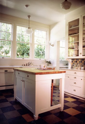
Kitchen in a Los Angeles home feels tres retro with its colorful well designed linoleum floors and a tile backsplash to match! (above)
I thought the floor in this kitchen designed by Los Angeles architect Kevin Oreck was original and fun. Colorful square tiles mixed an matched on the floor. I had to know more so I asked him a few questions. Kevin was kind enough to oblige!
Here’s today’s COCOCOZY Q&A:
COCO:What is overall style of house and what were you trying to achieve in this kitchen?
KEVIN ORECK: The house was built around 1915. Though the house is Italianate, the original kitchen was 1915 hi-tech: white subway tile, simple cabinetry. We tried to match that, but using modern appliances.
COCO:Please describe the floors? Were they created to mirror the backsplash?
KEVIN: The floors are Marmoleum (which is true linoleum) in a random pattern of 3 colors. We reiterated the pattern with ceramic tile at the baking area. In the rest of the kitchen we used white subway tile.
COCO:What kind of tiles were used on the backsplash?
KEVIN: We used inexpensive subway tile for most of it, but then nice trim tile from Country Floors.
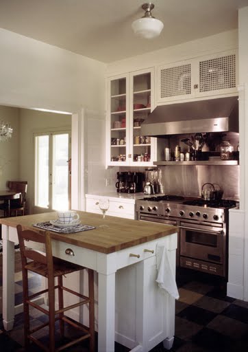
COCO:What kind of counters? Notice wood block on island…are other counters marble?
KEVIN: Countertops are ceramic tile with one marble counter for rolling out dough. I like islands to be different than the rest of the cabinetry, so we used butcher block there. That is also convenient for cutting. We used ceramic tile because it’s the most authentic for a house of that period. A lot of people are adverse to it because of maintenance, but it’s actually not too bad with the new sealers available and if you use unsanded grout.
COCO:Over the stove…you’ve used an interesting cabinet door…please describe.
KEVIN: The original kitchen had some vent grilles that we liked, so we put something similar in the cabinets above the range hood. Originally there was supposed to be a black panel behind to conceal the vent ducting, but then we decided it looked interesting exposed. This keeps with the 1915 hi-tech aesthetic. That’s why I also made the whole wall behind the range, and the back of the upper cabinets next to the range, stainless steel.
Anyhooooo…I like this kitchen with its linoleum floor. Thanks Kevin for sharing!
What do y’all think about it? (I say y’all only because I’m headed back to New Orleans tomorrow for Mardi Gras…and I’m just getting into the Mardi Gras party mood!)
xo
Coco
P.S. I like the school house ceiling and pendant lights too! All right in line with the look and feel of the overall design and architecture!






Great ideas! Love the contrast of the white cabinets with the floor.
Linoleum is such a wonderful and practical solution for high traffic rooms,and eco-friendly as well.
I love blog interviews. Thanks!
Great interview!
The linoleum floor really “pops” this kitchen!
But then, I have a special affinity for anything checkerboard. Kevin showed great restraint in using it in more muted colors. I only wear two items at a time myself!
And I agree with Herself and SogniSorrisi about the interview. I like to know what the designer is thinking.