ULLA JOHNSON – SOHO, NEW YORK
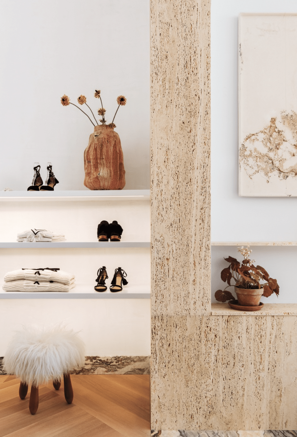
Ulla Johnson has been one of my favorite brands lately! They make such incredible dresses, clothing, and shoes. It’s no surprise that I love the design of their store. The interior is minimal yet, visually interesting and displays the products like the perfect canvas. I love the mix of wood, stone, ceramics, and plants in this section of the store.
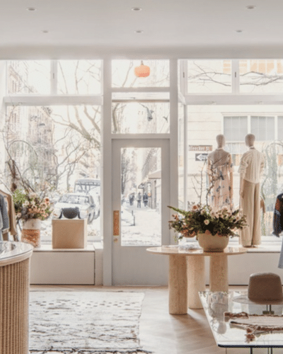
This photo really showcases how the space combines the streets of New York, product, and store design with ease. They all work together perfectly. I love the romantic additions of a vintage rug and floral bouquets.
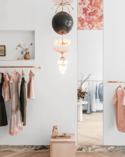
This section of the store is just stunning! I love the pops of pink in the clothing, shoes, light fixture, and mirror. Everything is put together with such purpose. The clothes are displayed like art in a gallery!
PARACHUTE – SAN FRANCISCO, CALIFORNIA
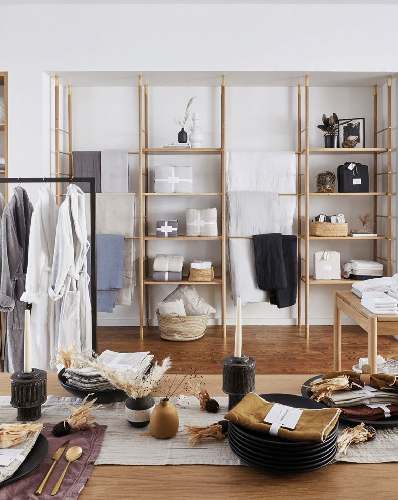
The Parachute store is a home good fan’s dream! Every item is beautiful and it’s all displayed like an expertly designed apartment. I love that it feels like you are walking through someone’s home. The store is great for exploring and shopping with purpose and being able to interact with the product.
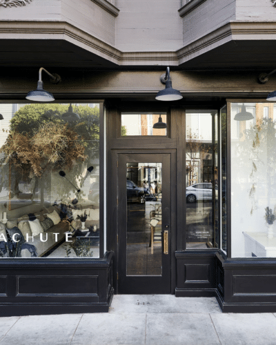
I love the exterior of this location. The choice to do black creates an interesting contrast with the light and bright interior. The large windows are stunning and would definitely catch my attention walking by.
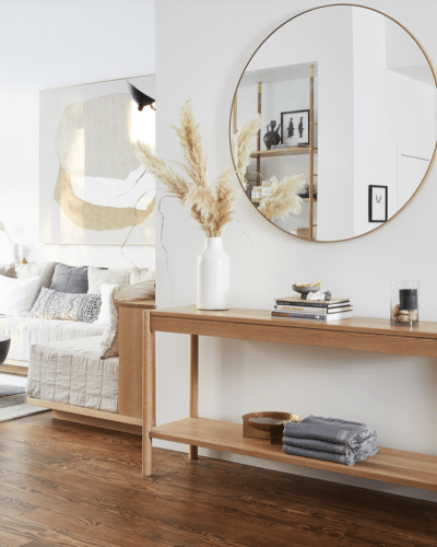
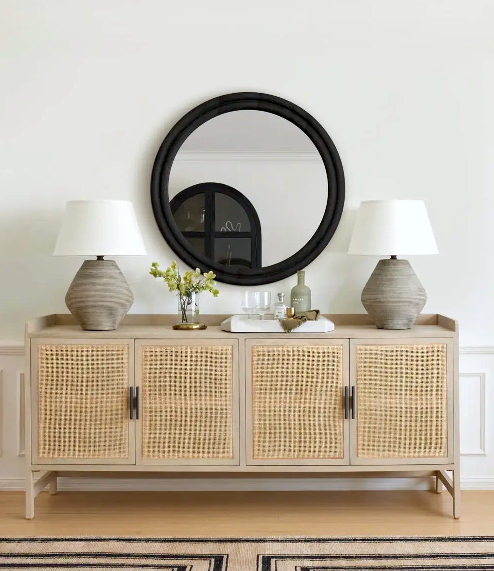
This small section of the store is so beautiful! I love the circle mirror and strategic placement of products on the table. While minimal in design it demands attention.
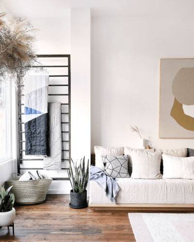
The couch just looks so cozy! Perfect for taking a quick break during your shopping journey and checking out some of the products in action. I love the combination of plants, linens, and art in this corner.
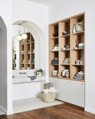
This is such an incredible idea to sell towels and bathroom products! The space is stunning and expertly organized. The design makes you want to interact with the product. I love the arched mirror and wood cubbies.
GOOP – SOHO, NEW YORK
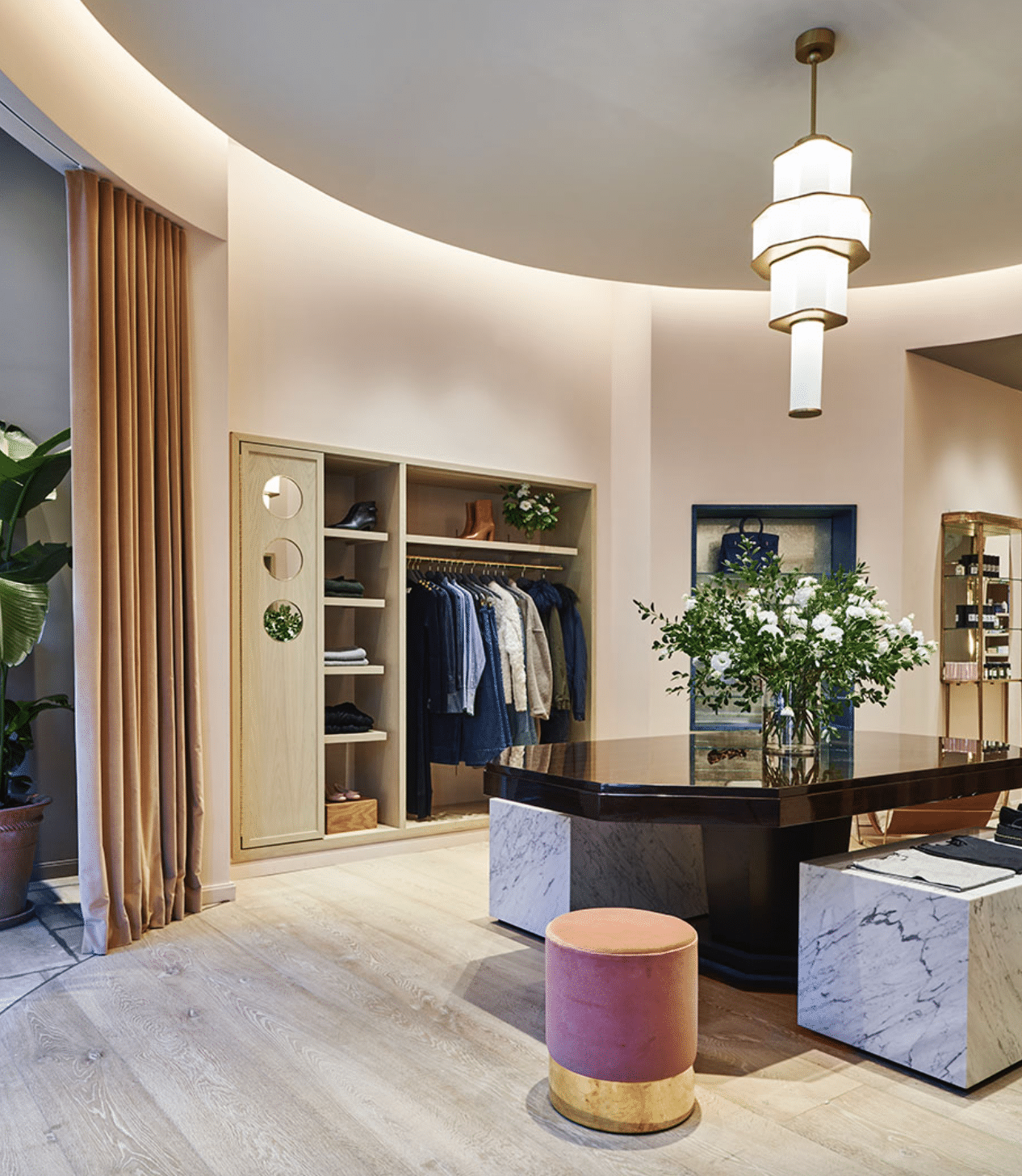
I love the luxurious and mysterious feeling of the NYC Goop store location. The use of black, gold, rose, and marble creates a refined yet, playful space. I love the combination of shapes throughout the design and the architecture of the room itself.
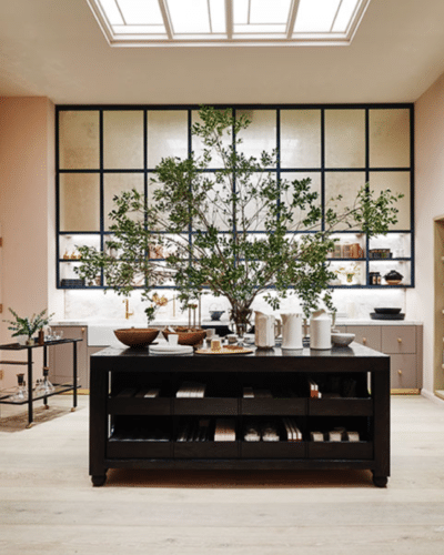
The contrast in this room between the black, soft pink, and greenery is stunning. The combination of colors just works! I love how spacious this area feels and how the product is displayed in a way that makes you explore.
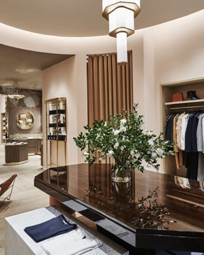
This image shows hints of clothing being displayed. It feels like being in a super luxurious walk-in closet. The dark wood table is such a focal point. I love how the light glistens off of it.
THE APARTMENT BY THE LINE – LOS ANGELES, CALIFORNIA
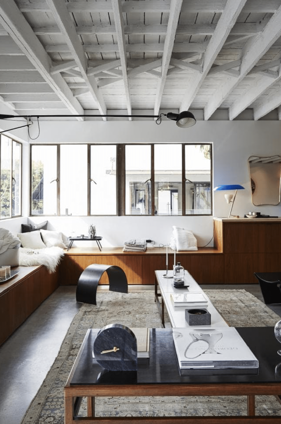
The Apartment By The Line is a home good + fashion store that is set up like an intricately designed apartment. I love the concept for this store just as much as the execution. I love that it literally looks like someone’s apartment yet, all of the items are available to purchase. The combo of white, orangey wood, and black is just beautiful.
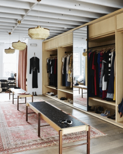
The fashion section of The Apartment is just as stunning as the rest. I love the rug, benches, and wardrobes. The addition of the mirror and light fixtures are great additions to the space. I would love to shop the clothing assortment and see what brands they carry!
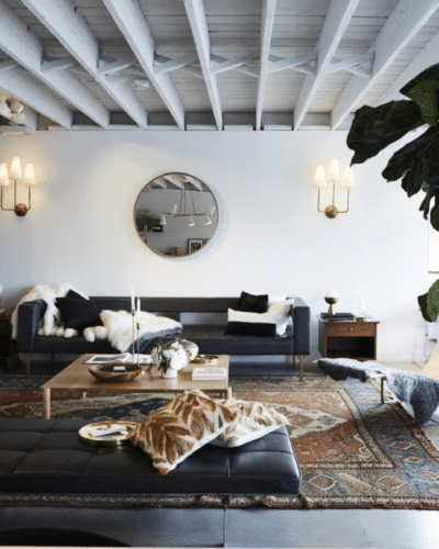
The living room of The Apartment is a bit darker and moodier. I love the huge vintage rug in combination with the black sofa. The details of this room help make the design shine. The huge plant, pillows, mirror, and lighting are the best additions.
A.L.C. – SOHO, NEW YORK
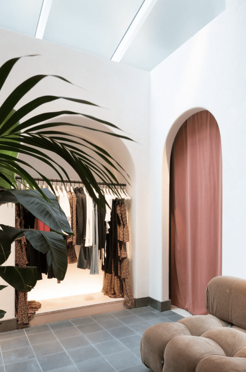
Next up is A.L.C. This retail space brings a feeling of warmer weather to NYC! I love the arched doorways and use of muted coral mixed with greenery. The space feels inviting, warm, and peaceful. The way the clothing is displayed is fun and luxurious.
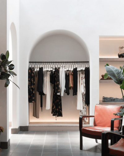
Again these archways are just stunning! I also love the dark grey tile flooring. It makes the space a bit darker and more mysterious. The use of plants and coral continues – and it’s gorgeous!
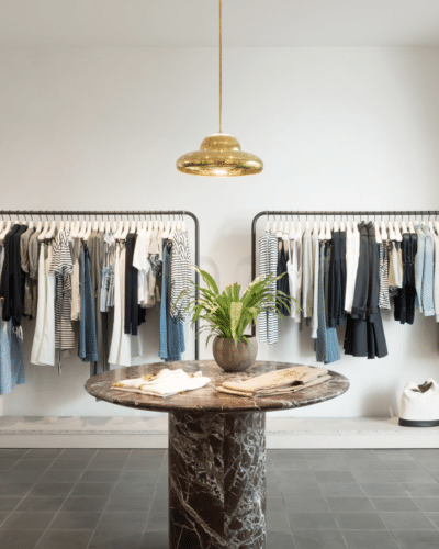
This area of the store displays the product a bit different. I like the smooth design of the racks and how the clothing is color organized. The gold light and table create a fun and interesting focal point to tie the space together.
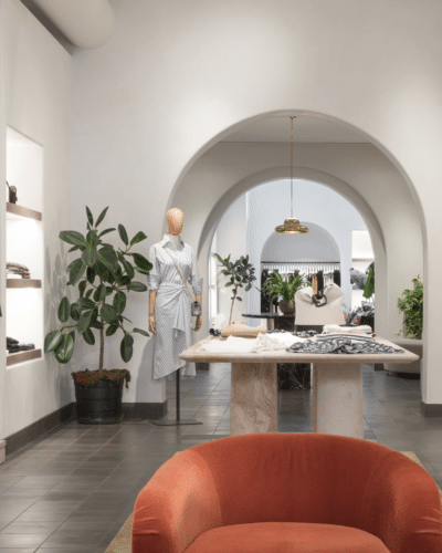
A triple archway? this area of the store is a beautiful hallway/corridor. The amount of plants works well in the space. More coral makes an appearance and adds the perfect rush of color.
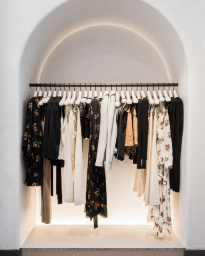
Another little archway displaying clothes – the lighting in these arches is incredible. It’s perfect for displaying the clothing and draws interest. Strategic placement of the clothing makes the space visually interesting.
KNOLL – LOS ANGELES, CALIFORNIA
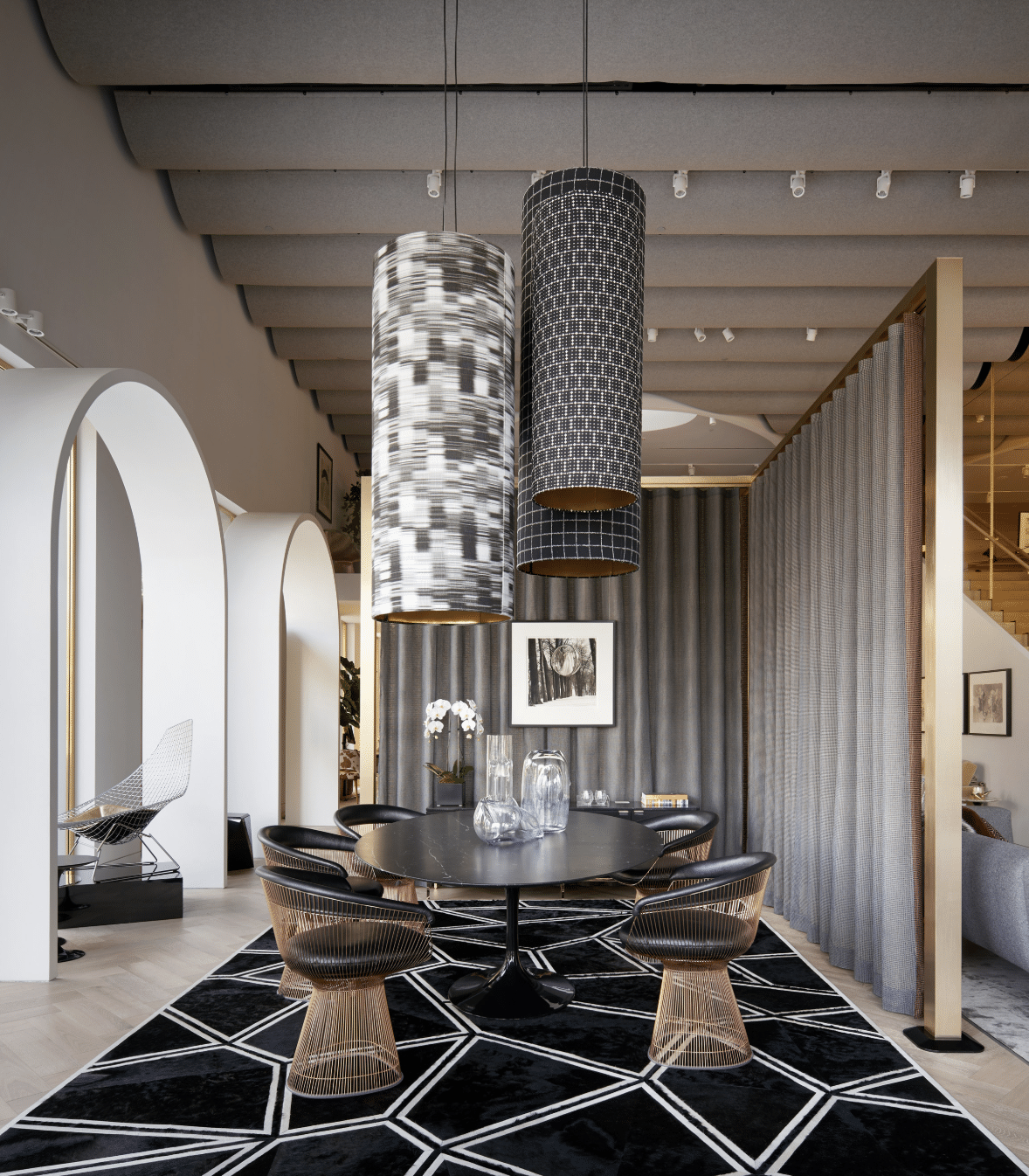
Knoll is a furniture and home goods store. It’s no surprise that the store has been incredibly designed and is full of beautiful items. This space combines white, black, and grey with amazing results. I love the architecture of the space and the choice of furniture. The chairs are intricate and visually interesting. Mixed with the rug and light fixture this space has a lot of moving pieces, yet comes together beautifully.
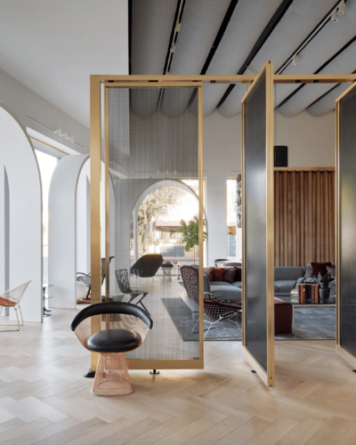
The room divider in this area is incredible. The gold + black combo work well with the rest of the space. It would be so great in a larger home or even an office. That living room back there looks very comfy and I love the color palette!
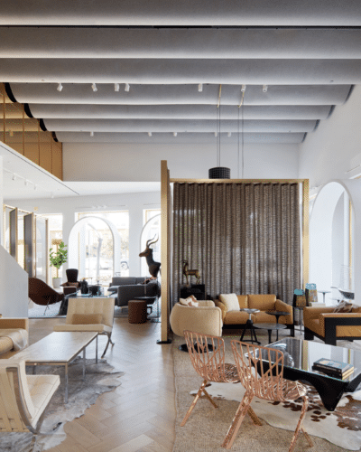
There’s a lot going on here but, it works well together. The space is broken up into different rooms/areas in a pleasant way. I love the copper/rose gold chairs mixed with the cow print.
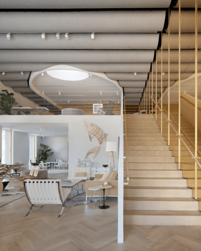
This staircase looks simple yet, there is so much design put into it. I love the mirror effect between the ceiling and stairs. The gold mirrored wall creates a cool dynamic. The sitting space to the left looks incredible all-white next to the staircase.
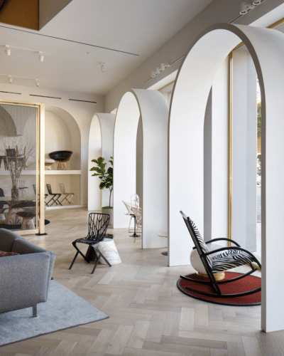
Architecture comes into play in this section of the store. I love the huge over the top window archways. And, It’s so interesting how the leopard rocking chair and small red rug are paired beneath an arch.
