
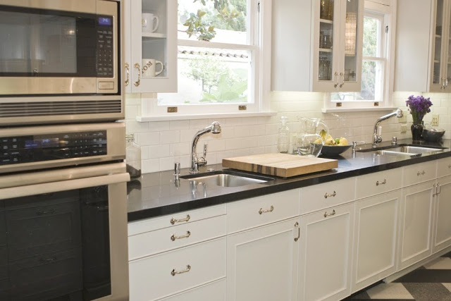
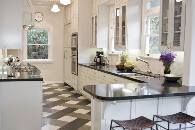
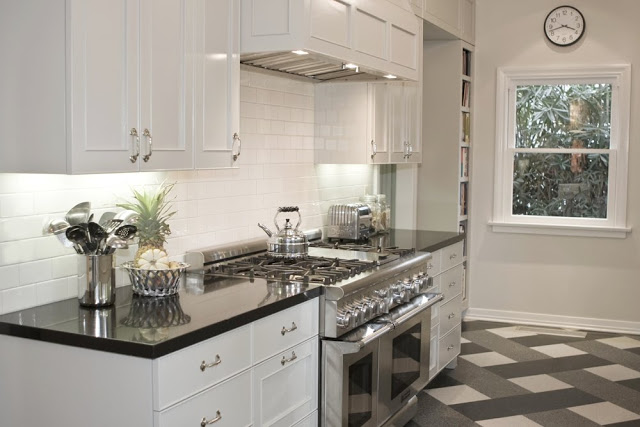
THE INSPIRING KITCHEN – Tom Newman’s kitchen in his Los Angeles home that has now inspired two COCOCOZY readers to redo their own almost exactly the same! (above)
Architect Tom Newman of Newman & Wolen designed this kitchen above for his Hancock Park home he shares with partner Ricky Strauss. I have seen this gourmet kitchen in person and it is a true jewel, a fantastic show piece of a room…a space definitely worthy of copying. The plaid floor, the schoolhouse ceiling lights, the stainless appliances, the paneled cabinetry and the gleaming black counters combine to make a perfect kitchen no doubt. I mention all of the elements of this kitchen but it is the genius of the floor tile design that really makes a breathtaking and exciting statement. So exciting that it has moved others to do their own!
So the story gets complicated from here on out so please stick with me…here’s the timeline
2008 – I first introduced Tom Newman’s kitchen to the blogosphere by doing a post on it in November 2008.
2009 – Less than a year later, I received an email from a reader named Arlene Fox from Idaho who had basically copied Tom’s kitchen inch by inch and created her own version at her home. So in July 2009, I posted that story about how Arlene and her husband pulled off quite an incredible transformation by turning their 1970’s kitchen into the smaller version of this inspiring Los Angeles kitchen!
Now that brings us to today’s story and the latest reader to be inspired by Tom and Ricky’s fab kitchen!
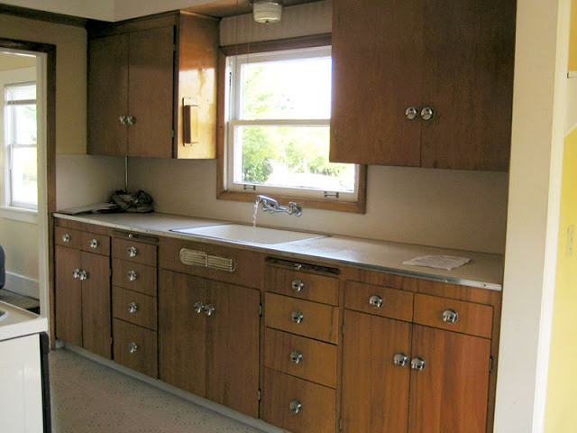
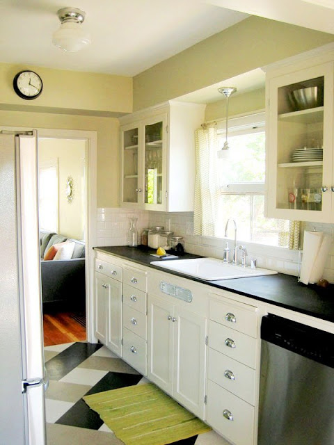
2010 – So just a few days ago, I receive an email from another COCOCOZY reader, Amanda Smith from Portland, Oregon, with before and after pictures of her recent kitchen makeover. Amanda used Tom’s kitchen as a literal blueprint for he adorable kitchen makeover. She copied the floor, the cabinetry, the lighting, the black counters and even down to the wall clock!
I love it that Tom’s kitchen has inspired two (2) readers to take action and remodel their kitchens. Tom should be very proud of his kitchen design at this point!
Here is COCOCOZY reader Amanda Smith’s inspired kitchen makeover below.
AMANDA’S KITCHEN AFTER (2010):
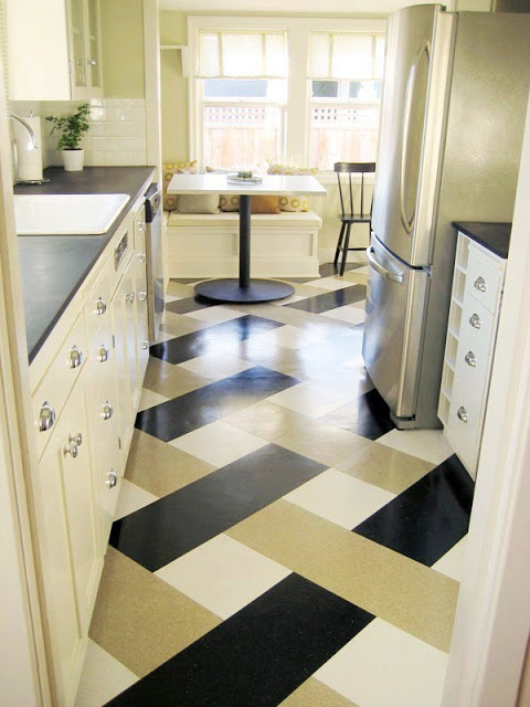
Amanda’s new kitchen…cabinets are painted Benjamin Moore “Old Prairie”, the counters are Paperstone in “Obsidian” and the floor is made of a vinyl compositio tile. (above)
AMANDA’S KITCHEN BEFORE:
AMANDA’S KITCHEN AFTER (2010):
ARLENE FOX’S KITCHEN MAKEOVER (2009):
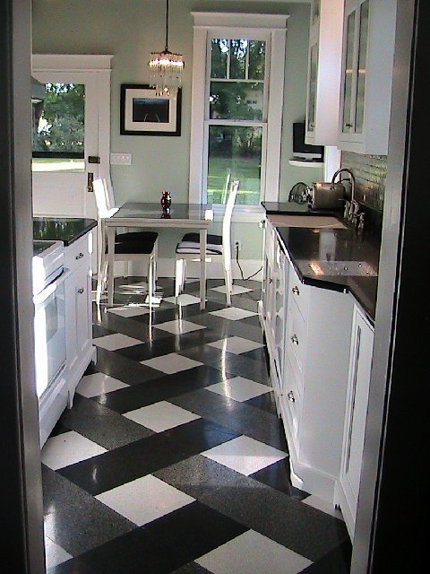
To see the before and after’s of Arlenes kitchen, click here. Her story is great too and transformation is stunning.(above)
INSPIRATION KITCHEN BY TOM NEWMAN:
I love the story of Tom’s inspiring kitchen. Each time I get one of these fun emails from readers, it makes me very happy. Makes me happy that something I posted on COCOCOZY inspired them to make a change in their lives and in their homes.
Thank you Tom for the inspiration. Your architecture design firm Newman & Wolen is awesome.
Thank you Amanda for sending in your photos! What a wonderful treat!
Happy Friday dear readers!
xo
Coco





LOVE this!!! How do those tiles compare price-wise to other flooring (wood, ceramic, etc)?
All kitchens are perfectly smashing—sleek and modern—with the pop of the unexpected and coool floor!!!!
I love that floor! So different! Thanks for sharing!
Jennifer
Mannington makes a hardwood floor in those squares and rectangles, it’s called Earthly Elements:
http://www.mannington.com/Residential/Hardwood/About%20Earthly%20Elements.aspx
divine inspiration from CoCo + Newman & Wolen. Thanks for the wonderful images CoCo. xx peggybraswelldesign.com
Now I have two soul sisters! Coco for introducing the fabulous kitchen to me in the first place, and Amanda for loving it enough to do the floor, also. Guess I should include Tom as a soul bro’ since it is his, and his alone beautiful design!
I love my kitchen and get compliments on it constantly.
Thanks for providing the inspiration and for remembering me, Coco.
Arlene in Idaho
Thank you Coco for this post… I didn’t know Tom Newman and I think he is amazing like the kitchens he designed…
Raffaella
http://melogranoantico.blogspot.com
They both look amazing!! Your photos are always inspirational…happy Friday!!
What a fabulous story!! Love the original of course and the redos inspired by your post – the floor is indeed a revelation in creative design!
I love those cabinets! What I like about the kitchens are that they look really functional as well as lovely to look at!
Love a funky floor…I am re-modeling my own home and if I had the cajones… i would do a fab floor like these.. I posted a couple more “funky floors” on my blog.. go take a gander”:)
http://amberinteriordesign.blogspot.com/
The tile has got to be a lot less expensive than wood, travertine or tile! I love it….not sure how it wears/ages compared to the more expensive alternatives, but it’s certainly worth more investigation. I understand composition tiles are supposed to be pretty tough. I’m just always leery of white “anything” in a high traffic zone.
Amanda’s before… WOW! Her kitchen truly is an inspiration! I love that she picked that dijon-y yellow as an accent color; it looks great on the floor! OK, I think that’s enough exclamation points for one comment… 🙂
Thanks, everyone! I actually only used the floor for inspiration from Tom’s kitchen, but the rest is also pretty similar. The ceiling light in my kitchen is original to the house. Thanks again Coco for featuring my kitchen! 🙂
Theres nothing like a nice classic white kitchen. Nothing compares. Always timeless.
Mr. Goodwill Hunting
Really catchy kitchen. White is mine favorite color. Even I have furnished my kitchen with white cabinets and flooring color. I am impressed to see your wonder kitchen.
Ummmm… That floor in the top photo is divine. I love it. Such great inspiration.
I was excited to have found this site with a galley style kitchen layout. My husband and I purchased a 1920’s craftsman home in the Olympic Mountains that we are remodeling “slowly”. We tore down all of the plaster and lathe walls..what a job! I would love to know where I could purchase the black, white and grey terrazzo tile plaid floor and duplicate this beautiful kitchen in a smaller version.
Thank you,
Pamela
Does anyone know the percentage of tile colors needed for this pattern? I absolutely love it but my tile supplier and contractor are having difficulty determining the quantity needed. I’ve selected a pricey tile so I don’t want to over order. Thanks so much for the inspiration! I love this floor.