These wonderful photos come from a bright college student/photographer Kara Shurtliff, a fine arts senior with aspirations of being in the photo world when she graduates next spring. Kara mainly shoots portraits and weddings…but most recently just started shooting interiors. This is one of her first interiors shoots!
This three story home belongs to a couple and their baby daughter. The couple’s style is very simple – no frills…none…clean…so clean…and no nonsense… really no nonsense. I like it.
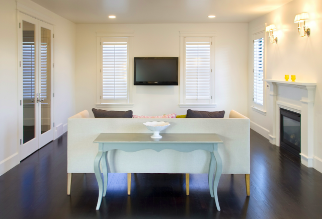
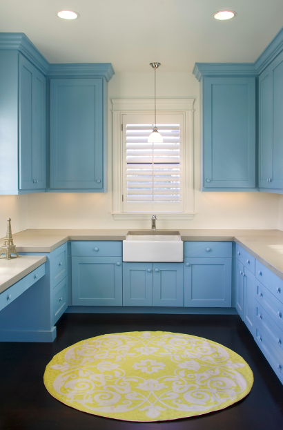
All clutter is completely edited out…just the basics with a little design flair thrown in. As you can see, this lesson starts with basic good bones – very white walls with dark brown ebony wood floors. Then, throw in the essentials as far as furniture – sofas and chairs in white, tables and beds. Next, add in a few stylish accessories like the union jack pillow in the living room and the great chandelier in the nursery to bring in an element of posh design. Lastly, add a dose of few surprising pops of color and pattern here and there; here they sparingly added color into the mix like the red and white brocade wallpaper in the powder room, the fabulous blue laundry room cabinets and yellow round rug and the pale pink nursery and art that almost give off a slightly neon hue, to give a sense that the space doesn’t just happen to look buttoned up but that it was in fact “decorated”.
Below, please see a basic lesson in how home decor can be effective and not that complicated…No Frills No Clutter Decorating 101!
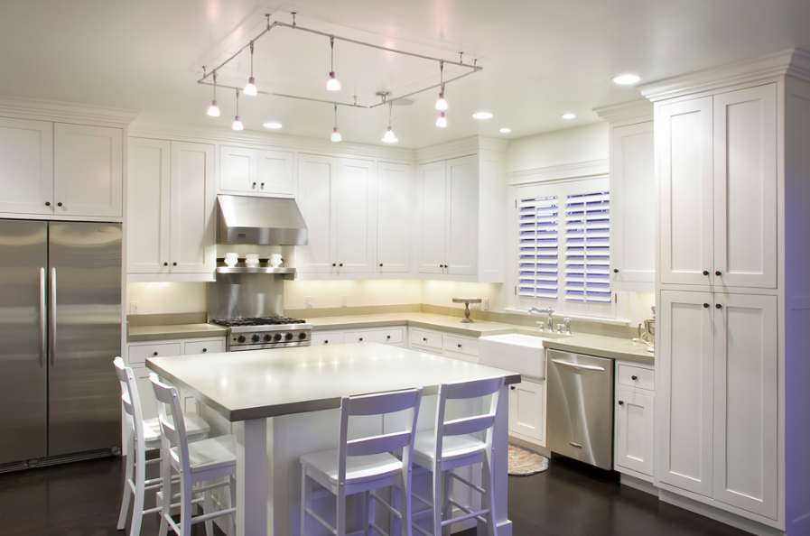
Lesson 1: Keep kitchen simple. White tall cabinetry flush to ceiling, stainless steel appliances, simple counter tops, white basic island stools.(above)
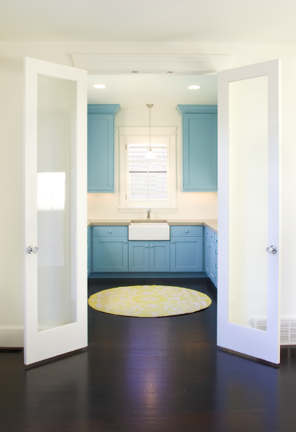
Lesson 2: Have fun with color in a normally drab space like a laundry room. Blue cabinets and a yellow rug make this small space a delight. (above and below)
Lesson 3: If there are any frills in no frills decorating, do it in the powder room. Red and white brocade wall paper and a Venetian style mirror make this little washroom feel delightfully designed (above)
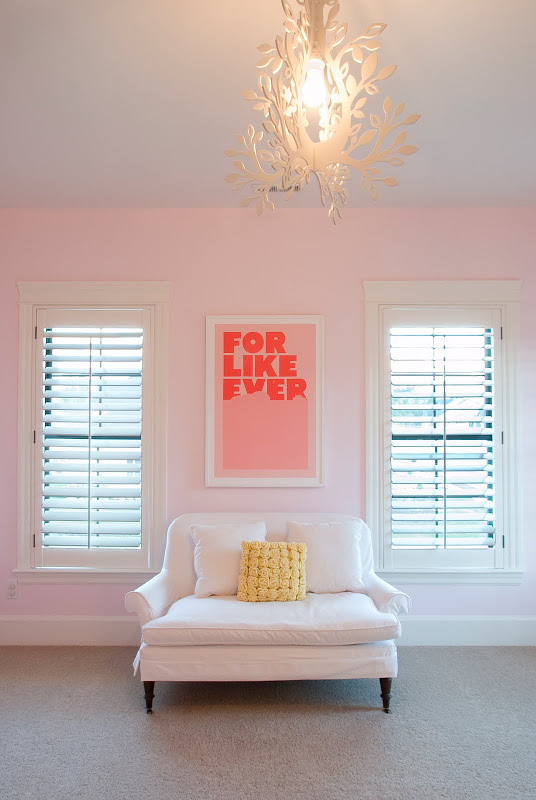
Lesson 4: Keeping clutter and tons of design frills out of the nursery can make for a very modern and chic baby room. In this case, pale pink walls, simple art, a perfectly positioned love seat, a great white metal modern tole chandelier and of course a simple white crib come together nicely to create a very cool space for baby. Lucky baby. (above and below)
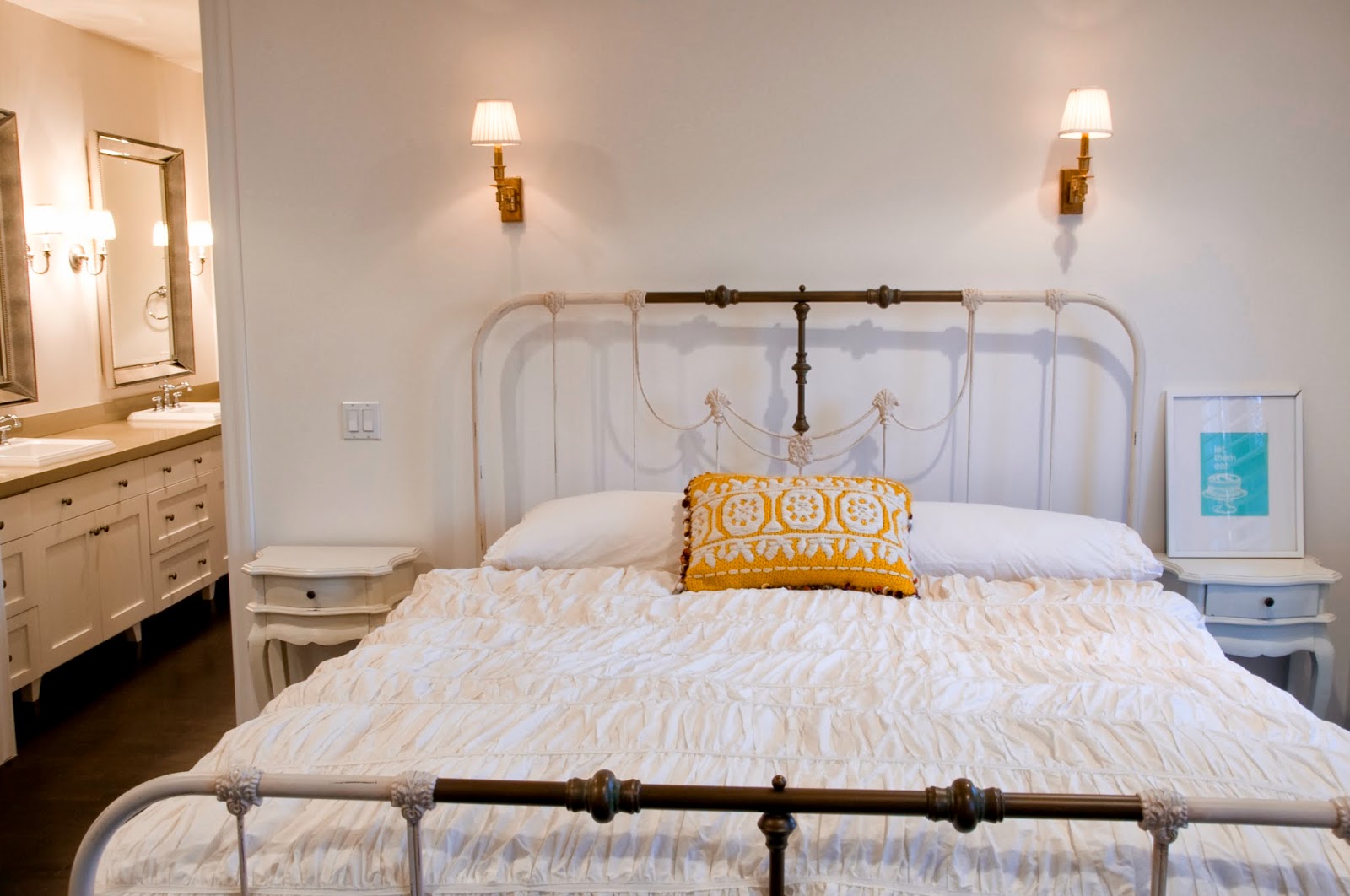
Lesson 5: A master bedroom is for sleeping not for staring at decor knick knacks. Take a basic wrought iron bed, a white almost quilted bedspread, a yellow quilted pillow and some simple side tables…and voila…you are done. (above)
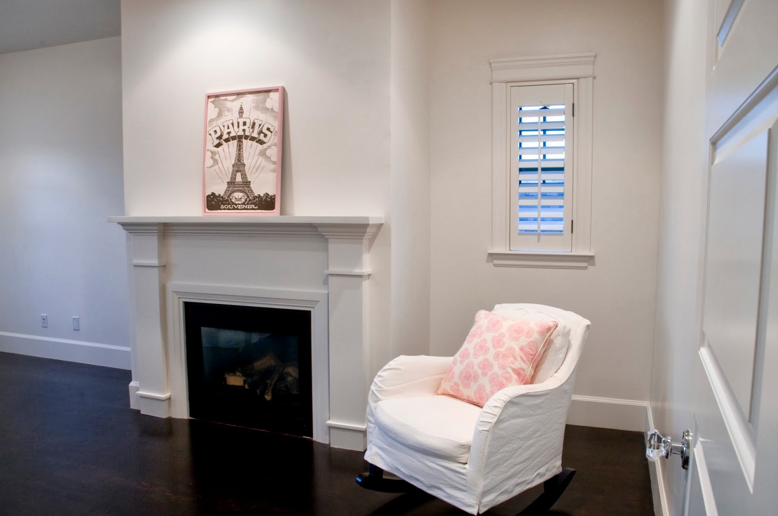
Lesson 6: Add subtle accent colors and repeat them. In the master bedroom sitting area, the pillow on the chair. The frame of the artwork on the mantel. They compliment each other. (above)
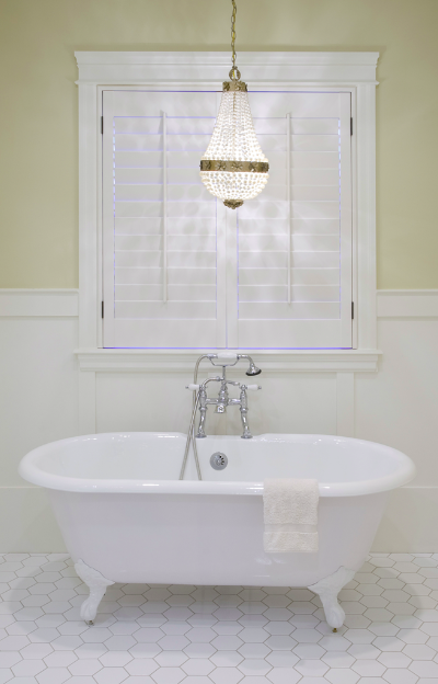
Lesson 7: Make the master bathroom a spa retreat by keeping all of the bells and whistles down to a minimum. A crystal chandelier + stand alone claw foot tub + large hexagon mosaic tiles on the floor + neutral wall color + half paneled walls = done! (above)
If you follow this simple lesson plan, you too could get an “A” in No Frills Decorating 101!
Thank you Kara for these great photos! I know you will do very well after graduation in your photography career! Really appreciate it!
Dear readers, please let me know what you think about No Frills No Clutter Decorating. What do you like? What don’t you like? What have you done in your home’s design that embodies “no frills”? Please let me know.
Happy Monday! It is raining here btw! Way to start off the week?!#$^ Anyhooo, happy Monday!
xo
Coco
P.S. Please remember to follow me on twitter too!







Overall, really nice. I can’t stand an overly cluttered, frou-frou space.
Great bones on this house, interesting uses of color. I think the no frills description of setting up house you gave is the perfect primer of “decorating basics”.
However, I would like to see a few more things here and there. E.g. a great little clock on the master bedroom tables, a photograph, or a vase of flowers. Just a bit too sparse for my taste.
It is beautiful in its simplicity. The kitchen is amazing. Beautiful, but no evidence of human habitation. Not even a toaster or coffee maker in sight! Love the floor color…just what I’m thinking for my place — only with more clutter. 😉
We enjoy a clutter-free lifestyle, too, but we do have work stations behind cabinetry that hide the appliances. Beautiful home and photographs.
Do people really live like this? + no flowers, toys etc..tooo sparse for my taste, but that is exactly what makes the world go round-suppose we all liked the same things!.. A great post Thanks for sharing these pictures + xx peggybraswelldesign.com
It is more like a clean slate for me I would have to add additional large contemorary artwork, books, , I admit I am decluttering all of the time!
Karena
Art by Karena
Love it! They managed to show great style with just a few elements. They have put quality work in the bones of the house and that is highlighted by not having a lot of clutter.
While it is definitely serene it lookos like no one lives there or that they are in the process of decorating, not completely done. I despise clutter as well but books, flowers, rugs and family photos warm a space, not clutter it up. To each his own.
I really like this! It’s so clean and sleek and also very tasteful with the touches of color and whimsy from the pillows, to the art work, wallpaper, and lighting! Makes me want to clean house and start over with my decorating!
I would not coin this as minimalist but as “vacant”…
I find the home void of personality and warmth; doubtful this is their long term strategy but it’s great spin. The home has lovely detail that will support any design style….would enjoy another peek once they expand their vision.
Love it!
Obviously, the house has been cleaned up for photos; everyone does that! We all know the kids and dogs dont have to get in a cabinet to play with toys!
As a recent newlywed with a military fighter-pilot husband, a ton of wedding gifts, and a tiny temporary apartment…I DREAM of a house this de-cluttered. Oh, to have the storage space! What a great reminder that ‘things’ are not necessary to create beauty!
that poor kid…
The house is really nice. Love the wallpapers and the colors they’ve used. However it looks like they haven’t finished furnishing and decorating it. Hotels have more little touches than these rooms. I probably have too much clutter, but this seems a bit extreme to me.
It’s appealing at first look, but as others have said, there is an emptiness to it which is cold. It looks like a house freshly staged for sale, not a home!
Such a neat home!
It’s simplistic and beautiful. I must agree with many of the other posts. I need just a little more though. It doesn’t exude warmth/friendliness to me (although fantastic.) It is my dream to be this FREE of too many things! I just need a little more balance. Love the powder room and laundry room.
No thank you! Brrrr and void.
Lovely post. Thank you!
I think it needs a shopping trip. But it is nice, and I do know people who prefer to live like this. I am not even close to one of those people… but to each their own!
What a beautifully, simple home – and Kara your photography is fantastic!!
I love your blog! I just wrote about a fabulous design store in Vancouver that I think you would really like! Come and see the photos 🙂
http://bit.ly/csaw0X
BEAUTIFUL! love the red wall paper in the washroom.
This home is so clean looking. I love the use of white throughout the entire house. I wish my home always looked like this! Thanks for sharing!
It is super beautiful, I am a little envious of how clean it is. But I don’t even think my house was that clean when I put it up for sale. : ) It does feel very sparse, like they haven’t moved in yet, especially in the kitchen with nothing on the counters.
Having said all that, it’s still REALLY BEAUTIFUL!!!
I find the lack of personality in this home somewhat disturbing.
Clutter free is a wonderful, but when you wipe all the color and ID from the room, any small personal touches look like a screaming snowman on a beach.
John Candalino
What I would give for bones like that, instead of the blue carpet and laminate counters that I have! I do appreciate a very clean, qulaity look and have moved away from clutter myself these past few years, BUT, as several others have said, I would like to see a FEW more touches of humanity. The kitchen in particular looks vacant. The impression I take away from these photographs is that they are a young couple with absolutely fabulous taste and a great graphic eye for shape and color (and a very decent budget) and they have concentrated on the bones of the space (great plan) and are now waiting. Waiting to find exactly what they want for each and every purchase. That whatever they bring into the home will be considered and will be the best quality. Perhaps in a few years there will be just a little more “stuff” about the place .
Love, love, love. But life is messy. I embrace our clutter and make it work.
I love, love love every bit of it. It’s clean perfection. I wish every house looked this clutter free!
Fabulous!
I could live in that pink wallpapered bathroom. Seriously! Are they looking for a tenant?
Where is the white metal light fixture in the nursery from? Thank you!
while it may photograph well, i agree with the poster who said ‘poor kid.’ and these parents are in for a rude awakening when that kid starts leaving things everywhere. or they must have full time help picking everything up all the time.
Like many of the above comments it’s just a little cold to me. It doesn’t look finished. I love the absolute cleanliness of it, but all white, all the time is just not my taste.
What a beautiful space!
BradChristopher
The home is BEAUTIFUL…but in certain areas it seems cold…like the kitchen…it needs flowers on the island an espresso machine maybe on the counter? The place could use a bit more artwork too! 🙂 Other than that its super pretty. :))))
http://www.madebygirl.com
madebygirl.blogspot.com
The pictures are beautiful but they seem lonely and sad. Too cold and hospital-like and has no personality. I prefer a home that has charm and character so that when guests visit they feel like they can sit down, sleep, eat, etc without having a fear of messing something up! But as far as no-frills are concerned, this nails it!
Helpful blog, bookmarked the website with hopes to read more!
The laundry room is stunning. If that were translated to the kitchen, it would be divine. The color of the cabinets and rug are great jumping off points. Yes, white-on-white is always classic, but too much feels either forced or just frigid.
As much as I want a “declutter” my life, this just seems so bland and absolutely uninteresting…I would love to see a cocktail party in the livingroom and a few big guys sitting in that couch? I guess after 30 years of marriage, 3 kids, and many redos, I have realized that people feel more comfortable in homes that have some color and comfortable pieces of furniture..I’m all about “living” in my house now more than ever! We all have different tastes, but when people come and enjoy my home for the evening they always talk about how “cozy” they feel after??? It is about some “clutter”, treasures, pictures, etc…speaks volumes about who you are!! Sorry this would not be a favorite of mine, and I’m being honest, it looks like the moving van just left..she needs a decorator to come and give her some advice!!
Simplicity gone sad. I’ve seen photos of spaces before that I just didn’t like whatever reasons- be it poor design, outdated, or some designed nicely that I could appreciate the design but perhaps just didn’t appeal to me personally. I don’t believe other than war photos, or old hospital & orphanage images I have ever seen a “home” so incredibly cold, sterile, bleak, and void of evidence of human life. Hospitals nowadays are warmer than this place and have a lot more personality. It’s not often I am so taken aback and feel deeply saddened just from looking at interiors- no books, no photos of family memories, no toys, nothing created by a child or the family displayed proudly on the fridge or in a nice frame. If I looked at this house as a prospective buyer I would cry; it is truly disturbing to me. To each his own and all that, but wow. As others said above- poor kid.
I can’t imagine actually living in this house. I would need to be OCD at it’s finest: constantly picking up and putting stuff away: one thing out of place would be chaotic rather than lived in.(And I am a person who throws things out and doesn’t collect junk.) Always picking up and putting away drives me crazy now because it takes so much time and attention in a busy house. Clearly these people are not home and have no personality from looking at their house.