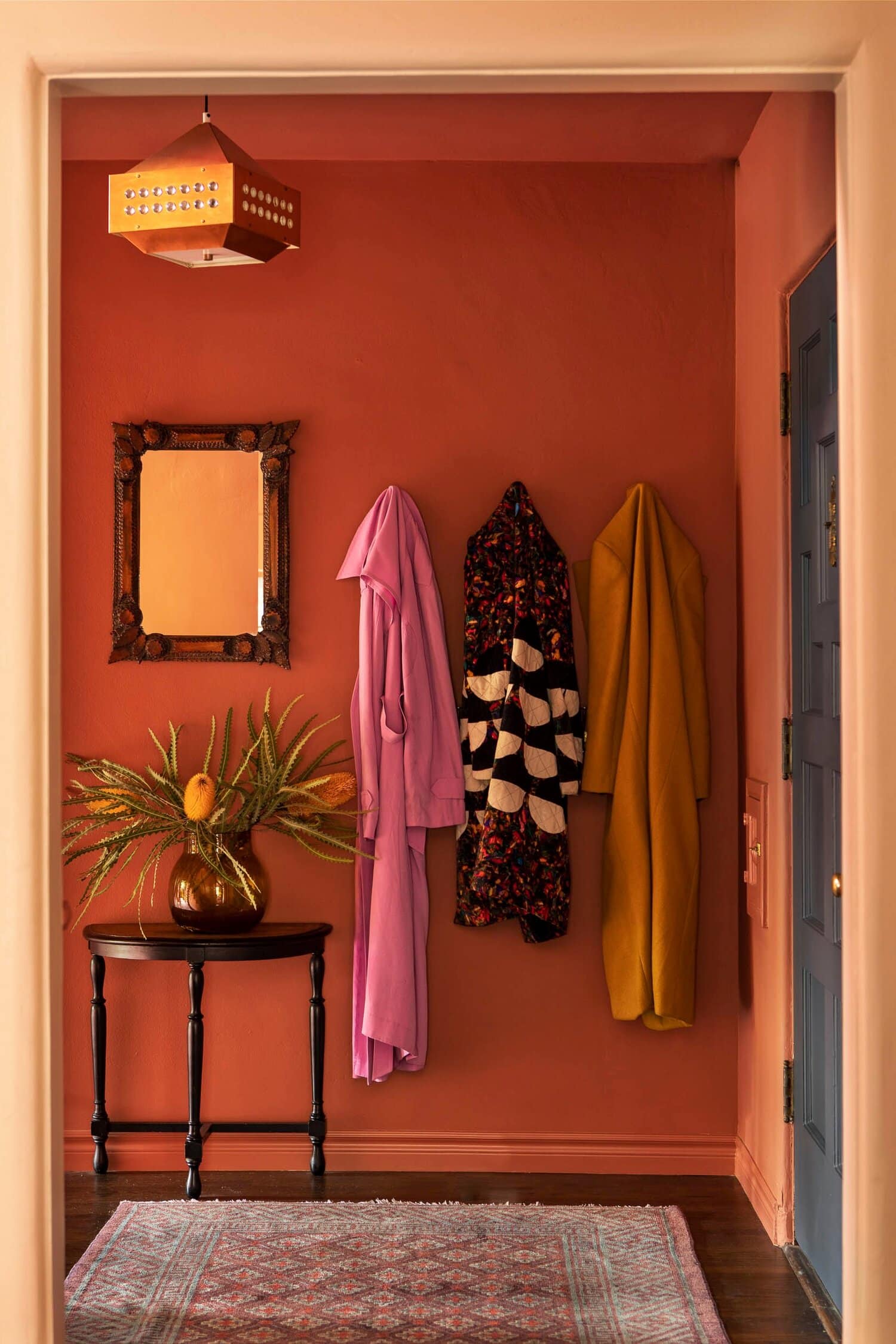
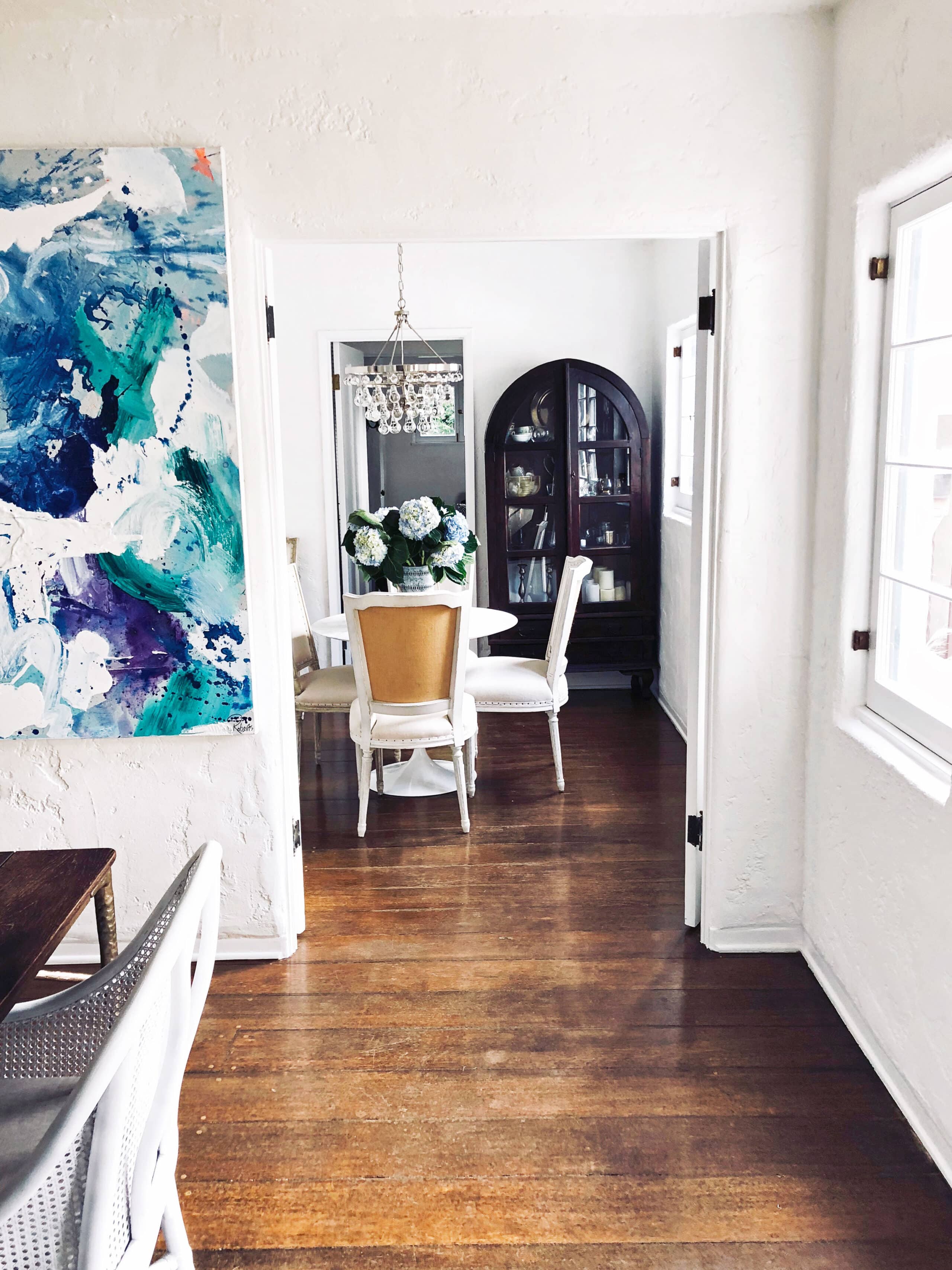
This gorgeous colorful Spanish colonial home is located in Franklin Hills. It was designed by Reath Design! When I ran across this home tour I was immediately intrigued by how well this home does color. This home is full of bold color choices and prints. I didn’t think it was possible to create a home with so much going on but this house makes it look easy. It’s not my go-to style but it’s incredibly beautiful and brilliantly designed. The darker feel to the home is perfect for the fall season!
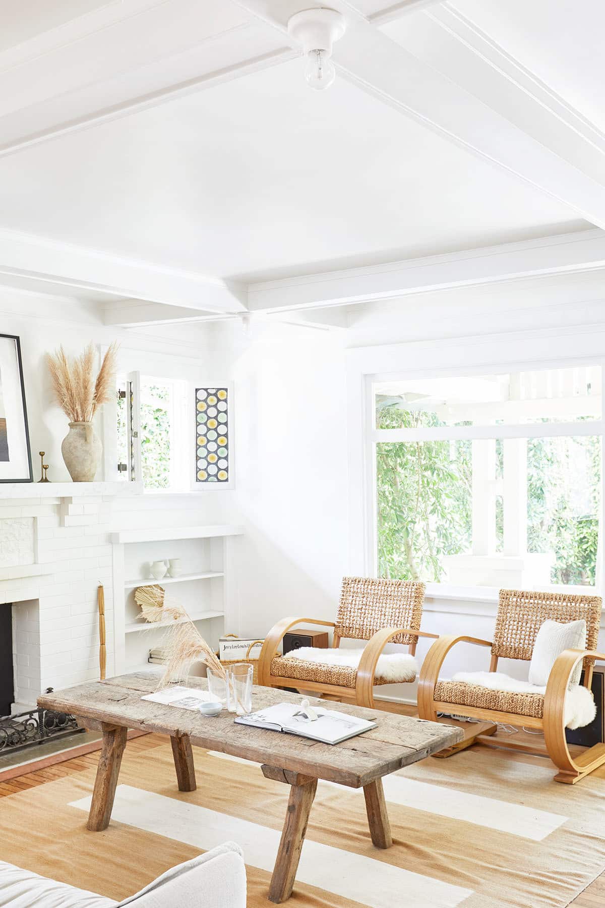
Today is a stunning West Coast House Tour. There is nothing quite like a beachy neutral designed home. While I may never own one I could look at images of them all day. The owner of this breathtaking home is the owner of the natural skincare line Lesse. It’s very clear that the owners of this home embrace the neutral color palette in all aspects of life. Let’s check out this amazing home!
So excited to share a few photos of the completed COCOCOZY Design House! Today, was so excited that House Beautiful decided to do an exclusive house tour of this remodel project I have been working on for almost 10 months. Last year, I bought the house and started remodeling it in April. Now, here it is, a 1930 classic Spanish Colonial Revival nestled in the hills of Los Angeles in an enclave called View Park.
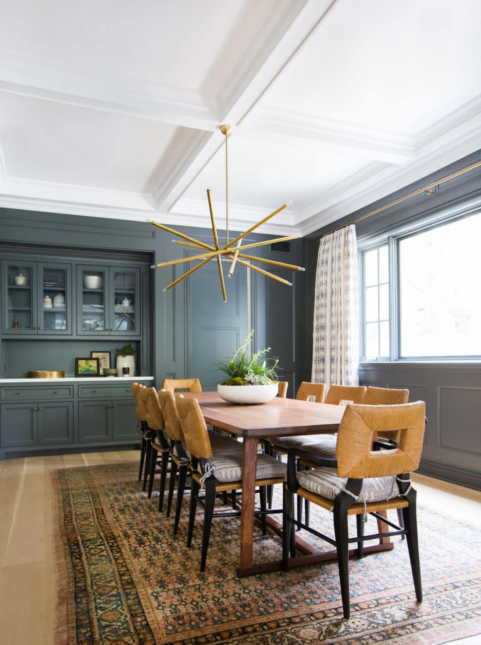
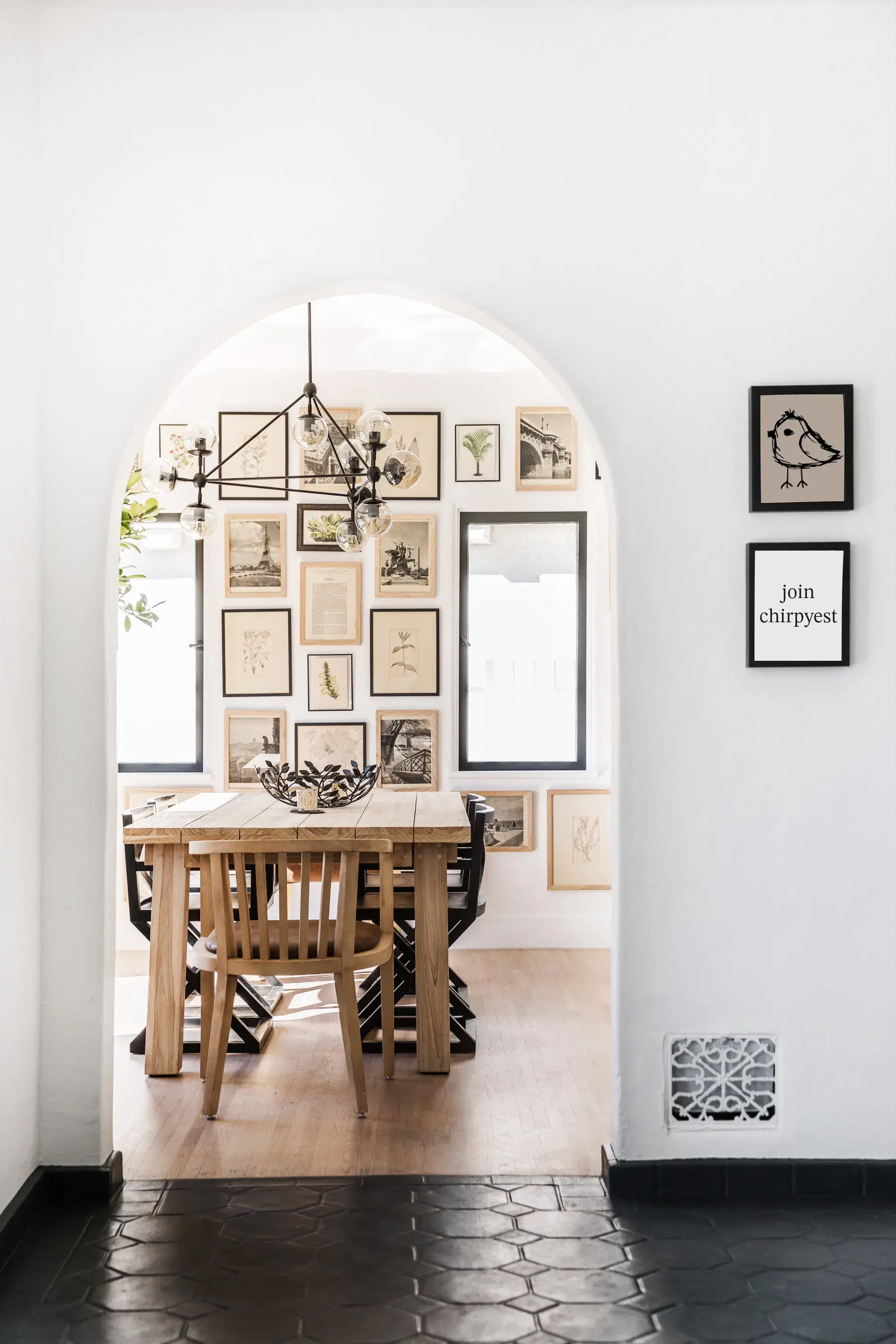
The dilemma remains, rug vs no rug in the dining room. I am trying to decide what to do at my house. Currently, I do not have a rug under the dining table. I always thought it was weird to have a table full of food over any surface other than hardwood, stone or tile, but lately, all these fabulous dining rooms with rugs under the table changing my mind. Dining tables with rugs underneath them are winning me over.
Let’s decide on the rug or no rug debate. Here are a bunch of great dining rooms: some with a rug under the table, some without. Which do you think looks better in these fabulous dining rooms? I found a few great ones with rugs under the table and a few without.
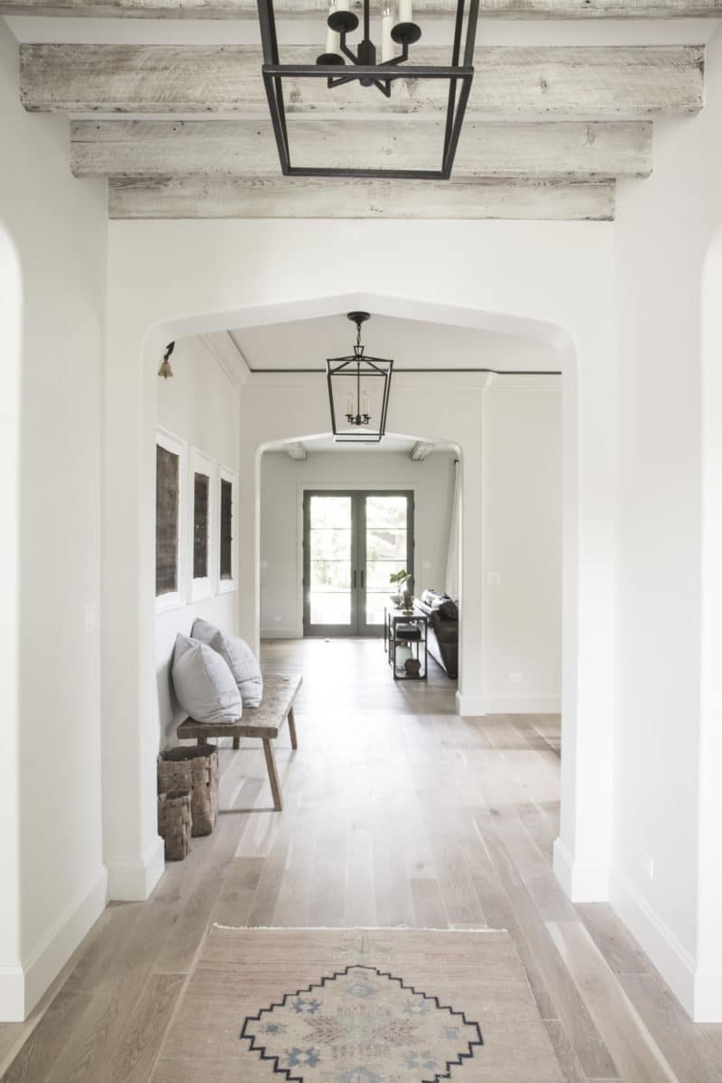
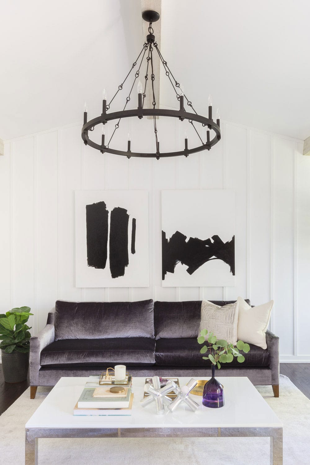
If I had to describe my style, it’s a mix of traditional and modern, so I love a rustic modern home. This home from Kate Marker Interiors is the perfect combination of bright and neutral. Tall ceilings and larger than life chandeliers define this rustic home.
From the exteriors to the foyer, the continued color scheme throughout sets the tone for this beautiful house tour.
Take a look below!
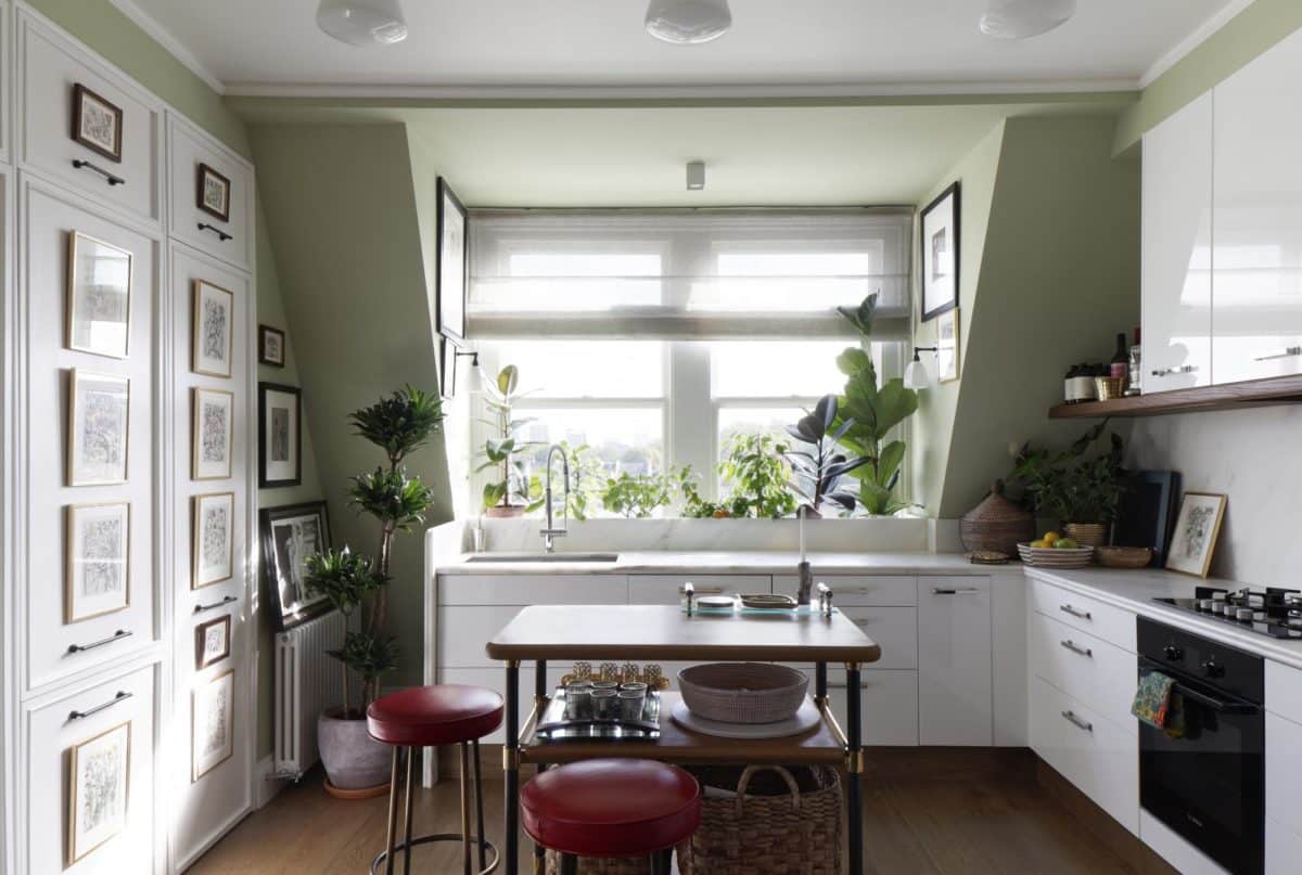
Who says small spaces can’t do great things? This small apartment from Martin Brudnizki Design Studio proves big things can come from a well thought-out space.
Martin Brudnizki carefully designed this eclectic space, where almost every surface is covered with framed art including the kitchen cabinets. Such a cool use of a small space and making walls tell a story. Notice all the unique and perfectly blended artwork throughout the space working with and enhancing the open layout.
Work on the COCOCOZY Design House continues.
Next step — lighting! This has been THE single most difficult design decision for this house by far. Lucky for me, Lamps Plus came on board to help me solve the dilemma. As one of our fabulous anchor partners in the COCOCOZY Design House project, Lamps Plus offered to give me lighting for all areas. Wait, what? All rooms and outdoor! Again, what?! All lighting! Yes.
Lamps Plus does have some brands they make themselves like Possini, Franklin Ironworks, 360 Lighting, John Timberland, and a few more… but in addition to those, they carry tens and tens of thousands of lights from other brands. I whittled down my selection after several visits to two different Lamps Plus stores here in Los Angeles. This was a real exercise in decision making!
Happy May! I just made a pretty big update in my breakfast nook. Can you spot it?!
Ok, I’ll just tell you. I recently opted to switch out the chandelier in the nook and I couldn’t be happier with the decision. Sometimes it’s nerve wracking to take the leap on a design switch, but I’m all about following your gut.
Take a look at how my new light fixture changes the feel of the room (below)!

